We’re visual creatures. As a species, we may be capable of some awesome feats, but at heart, we do like to look at pretty things. So, it’s no surprise that when we want to improve email marketing, just as with most marketing, we need to turn to the visual side of things to make a significant difference. By this, we mean pure appearance. In other words, it has nothing to do with the content at all. There are several aspects to this, which we’ll cover in turn. But first, let’s see just how important email marketing visuals are in reaching your target audience.
Visuals and Email Marketing
The first thing to think about when it comes to the importance of visuals in email marketing strategy is the ludicrously short attention span most people have. It’s reckoned to be about 8 seconds. So, you have the time it takes for one deep breath to make an impact.
Words take time to read and can, let’s face it, be a bit of a snooze to get to grips with. There aren’t many writers who can compel a reader to stop and ingest based purely on the electrifyingly engaging prose before them.
Visuals, on the other hand, work by short-circuiting straight to the processing zone.
How much quicker are email marketing visuals processed?
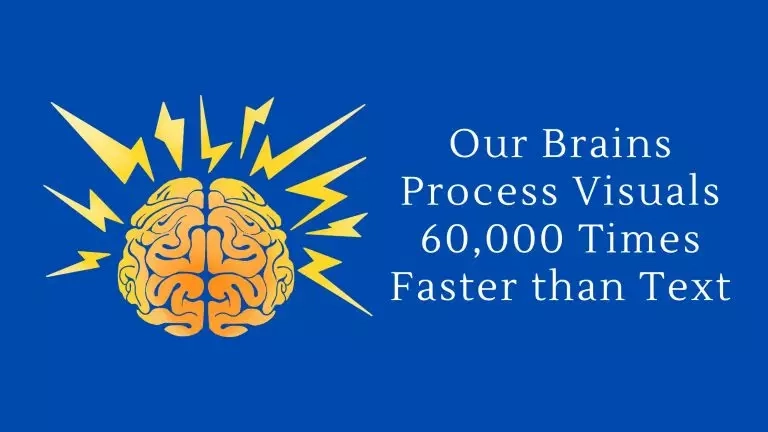
Image sourced from e-arc.co.uk
This strikingly designed graphic gets attention through a dual approach. There’s the spark-strewn brain on the left that grabs the eye. Then there’s the arresting stat that claims our brains are able to process visuals 60,000 times faster than words. Incredible.
It’s also not true. This is one of those enduring myths that those up against a deadline tend to perpetuate in the search for a stand-out statistic that will make their article zing. A case of “if in doubt, print the legend.” But we can still applaud the design—that brain does look pretty lively!
So, what’s the truth about visuals?
While the above stat is a gross exaggeration of the situation, the truth is that we are very, very quick at processing visuals. How quick? About 13 milliseconds. To blink your eye takes around ⅓ of a second. So, we are able to take in and identify visuals about 30 times faster than the time it takes us to blink. That is amazing.
The evidence suggests that we can process images about 15-30 times faster than we can process text. As we mentioned, humans have 8 seconds of average attention span. By using visuals to attract attention, we actually get the equivalent of up to 240 seconds worth of pulling power.
Your competitors already know this
It’s also worth remembering that to stay ahead in email marketing, it’s essential to not only focus on improving your visuals but also keep an eye on your competitors.
Analyzing your competitors’ strategies can provide valuable insights and inspire creative ideas for your own branding efforts. By observing what works well for them and identifying gaps in their approach, you can fine-tune your email marketing visuals to stand out in the crowded inbox.
How to Improve Your Email Marketing Visuals
We’ll turn now to the main areas of visuals used in email marketing and see what they can do for you.
Include images for engagement

Screenshot of an email from Poppy + Ted
Email marketing is trying to sell stuff. Yes, I know—we’re not doing doctorate-level work here. But it doesn’t hurt to remember that, as fancy as an email or any other marketing can be, at its heart, it’s just seeking to get customers at some point to part with their cash. That’s pretty much the name of the promotional email game.
So, it makes sense to use imagery that strikes at the core of what you’re trying to sell and delivers email engagement. In the picture above, it’s a target audience easy hit. Email clients who are interested in dog gear are going to love getting relevant content and a picture of two dogs looking pleased with themselves on a bed. It’s a simple eye-grab technique, so use it as a prime email marketing tool.
Why is it effective?
It’s not for nothing that the old adage says that a picture paints a thousand words. In some instances, a picture paints what an infinite number of words can’t convey. It can set the mood, like that pair of pooches. Or it can show exactly what you’re trying to sell.
The fact is, people like to see for themselves what it is they’re being asked to consider before committing any more time to the transaction.
So, suppose you’re trying to get some traction for a particular product or service. In that case, whether it’s shoes or an enterprise fax solution, you should endeavor to include an image that says something about it.
Great example of images in email marketing
It might be that the marketing email is not about a particular product but is a means of enhancing email list customer retention by reaching out to them at key moments in their lives. Here’s a great example of this.
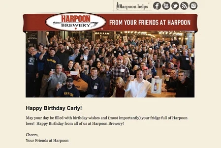
Image sourced from Hubspot
This is a terrific use of visuals as it provides something that words would struggle with. There’s warmth and fun a-plenty (although the dude on the extreme right looks a little undecided).
OK, it’s all fakery in that the same pic crops up for every customer’s birthday, but that doesn’t matter. The image makes the customer feel great. And a little more connected with the brand.
Images can do this. They have the power to circumvent the rational side of the customer and provoke an emotional response. This is what helps to make emails a very effective marketing channel.
Use colors to set the mood
There’s a whole world of academia devoted to the study of color and its effect on individuals. It makes sense then to include a consideration of color when we’re thinking about how to improve email marketing visuals.
It’s been found that different colors have different associations in terms of characteristics. It’s important, therefore, to get the right color to go with your product launch or with the mood your email’s trying to engender:
- Black, for instance, associates with intelligence and authority. You’ll find that most government websites are very much all about black text on white background.
- Blue? Security and trust. Great color for anything medical. Remember that brain pic with the totally untrue stat? That blue may well have helped with getting us to believe it.
- Green is, as you might expect, all about calm and, of course, ecological concerns. A lot of environmentally conscious products will feature a green palette.
Get ahead with red
Red is very passionate and exciting. Here’s a terrific example of its use in an email marketing campaign.
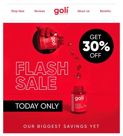
Screenshot of an email from Goli
There’s simply no ignoring it. It helps that the product’s red, of course, but the email marketer has opted to go all-in on the red, using it as the background and the text color too. It’s as red as red gets.
Note also the great use of simple color contrast. You’ve got the excitement of the red washing over everything in sight like a big Martian flag, but then you’ve got the chunks of black against it, where you’ll find the important information.
Passion overwritten with authority. What some marketers would take a whole email sequence to convey they’ve done with just one. Fabulous work.
One last point on color. Try to use it to highlight areas you want your customer journey to include. An obvious example is a contrastingly colored CTA button.
Fonts
It’s easy to overlook fonts. They occupy that space between content and image, kind of being a part of both and yet neither. They’re super-important, though, and can influence click-through rates.
We all have our favorite fonts. However, not all of them are a good idea when it comes to marketing email usage. This is because of two factors.
- Not all are web-safe fonts
You need to stick with what’s known as a web-safe font in order for your vision to remain the same no matter where the receiver is reading it. Web safe fonts are more likely to be supported in email clients. There’s quite a variety available, so you should be able to find a font to suit.
- Not all web-safe fonts are email-safe
To be completely sure that a font is suitable for email use, you should pick one from the specific email-safe list. These are fonts that come pre-loaded on nearly all computers and devices. It does limit your choice, but it still includes classics like Arial and Times New Roman. If you do need to use a different font, there are ways to code web fonts into emails.
- Not all are suitable fonts
Not all web-safe fonts are a good fit for some products and services. For instance, Comic Sans MS won’t be suitable for everything and will put off some potential customers.

Image made by writer
To make matters worse, it’s in orange (which is associated with being impulsive).
In general, you want a font that is striking, readable, and suited to the subject matter.
Pitfalls
- Don’t overdo it
Emails that are too image-heavy are often consigned to the spam folder. Even if they don’t, an image or video-stuffed email may take too long to load or only partially come through, both of which harm the user experience for the email recipient.
- Be original
One of your biggest challenges is to avoid visual cliches. If you’re selling domain names Australia, then Ozzie-themed pics should certainly feature, but maybe not a picture of a kangaroo posing in front of Uluru with a boomerang on its head.
- Size is important
When you’re putting in an image or a video, consider the range of devices your marketing email may be viewed on. You don’t want to swamp a mobile user with an IMAX-sized visual.
Remember that larger visuals take longer to load, so try to keep your images to around 600-800kb. To ensure images are optimized for mobile users, you’ll want to export them with a resolution of 72 dpi.
Image is (Almost) Everything
So, we’ve established the importance of getting visuals right when you are trying to improve email marketing. There are no two ways about it: better visuals = better marketing emails.
The way to take advantage of this is to use image, color, and font in a blend that readers simply can’t ignore.
But that’s not quite everything. Here are two final email marketing tips:
- It’s hugely important for you to carry out email testing yourself on as many different devices as possible. Only then will you be able adequately to assess any improvements you’ve made.
- When it comes to email marketing efforts, never focus on improving visuals at the expense of email content. You still need to get some great copywriting in there, or you’ve just ended up with a pretty illustration.
It’s all about finding a good balance between images and text so that readers have all the information they need to take the desired action – whether it’s returning to their shopping cart or signing up for a product demo.
The most effective email marketing campaigns are an irresistible blend of visuals and content. It’s all in the mix.
Written by our guest writer Emma Hopler
