

The large Facebook cover photo decorating the top of your profile page has been a Facebook page feature for some time now. It’s the first thing a new visitor sees when they land on your Facebook profile page.
For some marketers, the Facebook cover photo takes up an annoying amount of space on the page. But what if you could do more with the Facebook cover photo?
Just like a header image or a hero image on a landing page, the Facebook cover photo can be a fantastic visual tool to help you facilitate more conversions.
In this article we’ll look at the Facebook cover photo and how we can use it as a call to action. We’ll share 5 easy Facebook cover photo CTA hacks to help you get more conversions.
Let’s get started.
1. Highlight an Important Facebook Page Tab
Facebook Page Tabs are powerful for driving in-Facebook conversions. Studies have shown that Facebook users like to stay in Facebook when browsing. Ads and wall posts that link to external web pages have much lower conversion rates than ones that link to Tabs.
Tabs can house signup forms for webinars and email newsletters, contests & promotions (like those offered by Wishpond), and content such as articles and infographics.
The easiest way to call attention to a Tab with your cover photo is to include an arrow, like in Wishpond’s example below. You may already be a fan of including arrows to point users in the right direction on your website CTAs, so you’ll be able to use this type of formula very easily:
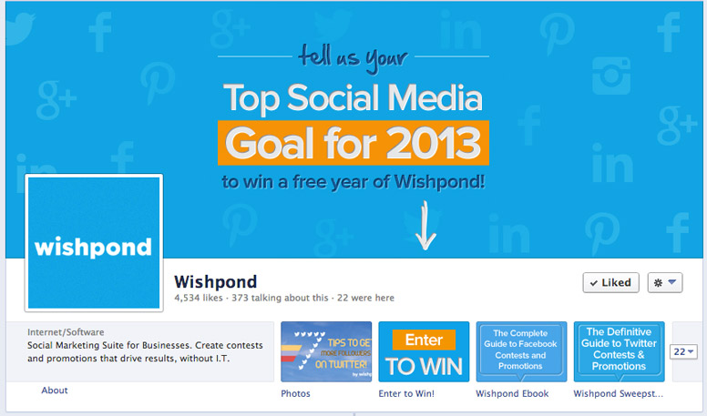
There are two best practices to follow when using this method, which are seen in the example above. These help to decrease user confusion that occurs because the of gap between the cover photo and Tab, as well as the other visual noise in the area:
1. Use the same colors and style in the cover photo and tab icon to make it obvious they are related.
2. Include text that re-affirms what you’re saying in the cover photo. This assures visitors that what they are clicking on is what you’re describing in the cover photo. If you just show a logo on the tab icon, users may get confused about whether or not it is what they are supposed to click.
Make sure to avoid having the arrow point to one of the elements above the tabs, like in the example below. By pointing to the “Like” button, this Page may be confusing users on what exactly to click:

You can avoid this problem by having your “action” Tab be in the second or third tab spot, like the Wishpond example above.
Put this method into action with a cover photo that includes brief, easy-to-read text on the middle-right-side and an arrow pointing down to the Tab that houses the content or registration form. Make sure to include similar text and design on the cover photo and Tab to make it obvious they’re related.
Here’s a bonus example from Livestrong. They used their cover photo and tab icon image in a pretty cool way to draw attention to the blog Tab below. The black background and bright yellow ribbon make the Blog tab stand out, and the path of the ribbon does a great job of carrying your line of sight down the page. This is something you can try on your own Page if you have a bit more design skill than I do:

2. Promote a Website
Driving traffic to an external website from Facebook is tough, as Facebook users are generally hesitant to leave their social network behind. But if you provide some incentive, it can be done. Cover photos can’t be linked to another web page, so you can’t include any normal CTAs like buttons on it. But what you can do is write out the web address with brief verbiage to visit it. Avoid making the web address looking like a hyperlink. Don’t use blue text. Instead, use text like “Visit our website” or “Check out our exclusive at …” to make it obvious to users that they need to type the URL into the address box to access it. Red Bull Racing did a nice job of making the web address stand out by using red text. They also provided a great incentive, with a time-sensitive kicker, to drive traffic to the site. And keeping the CTA to the right will keep it from getting jumbled in with the profile picture on the left side.

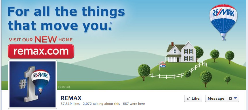
Here are examples of two real estate companies, REMAX and Austin Realty, using their cover photo to drive traffic to their website. They both use great text to tell users to check out their website, although REMAX does use a button style around the web address, which I think will confuse some users:

Put this method into action with a cover photo that includes brief, easy-to-read text on the middle-right-side that gives users an incentive to visit you at your web address. Avoid using any design that looks clickable, like a button or hyperlink. Design it as if you were designing a print ad or billboard.
3. Promote a Local Business
There are two ways to promote a local business using your cover photo:
The first is to simply tell people to visit your location and provide your address. This method is very similar to 2. Promote a Website. It can be done by simply. By including a photo of your location’s storefront and your address. Another way to do this is to create a cover photo that includes a screenshot of you location on Google Maps with a text CTA that includes a bit.ly short link to get directions to your location on Google Maps. The short link can direct users directly to the coordinates of your location on the Google Maps website.
An alternative way to promote a local business using Facebook is to offer printable coupons in one of the Tabs that can be used in your physical location. A survey conducted by market research company Lab42 found that the top way people interact with a Page on Facebook is by printing off coupons that Pages offer.
This second method can be executed by adding an arrow that points down to the Tab where the coupon is housed, just like in method 1. Promote a Facebook Page Tab.
4. Promote Gated External Content (Ebooks, Infographics, etc.)
Gated content requires people to fill out a registration form or take some other action to access it, and is one of the cornerstones of inbound marketing. While it is not easy to fit content like ebooks and infographics inside of a Tab, you can fit the registration form inside, like how we did below:

This allows you to use the same strategy as 1. Promote a Facebook Tab even if your content cannot be displayed in a tab. Having the registration form directly in Facebook will increase conversions, as taking users outside of Facebook leads to much lower conversion rates.
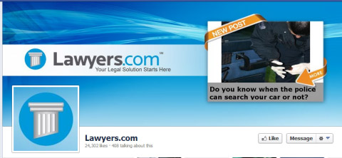
Lawyers.com tried a different method below for promoting a new blog post. I think it’s cool that they showed a preview of the content right in the cover photo, but I think they’ll have a tough time getting people to know to find their blog to check out the rest of the post. For this reason I wouldn’t recommend this method. There are tons of custom apps that allow you to house your blog inside a Tab – such as Networked Blogs – and doing this will allow you to create an easy-to-understand CTA for your blog posts:
Put this method into action with a cover photo that includes brief, easy-to-read text on the middle-right-side and an arrow pointing down to the Tab that houses the content or registration form. Make sure to include similar text and design on the cover photo and Tab to make it obvious they’re related.
5. Get More Likes
Cover photo CTAs are a great way to get people to focus on Liking your Page. But if you just give them a CTA that says “Hey Like My Page Please!!!!!”, visitors won’t show you any love. You need to provide an incentive for them to Like you. The transaction of a person Liking your Page is very similar to signing up for a newsletter – you need to provide some value in return for them taking the desired action.
The best incentive is to provide something of value that is “coming soon”. This requires users to Like you in order to hear about the incentive when you post it in the future. This works best when you include text that the incentive is a “Facebook Fan exclusive” – so Liking you is the ONLY way to get in on it.
So what can you use as an incentive??
In descending order, these are the three best types of incentives that I have seen work for our customers to get people to Like their Facebook Pages:
1. Contests: Giving people a chance to win a big prize is the best incentive. It creates excitement within people, and also gives them something awesome to share with friends – especially if the prize is something exclusive, like an unreleased product or tickets to a sold-out event.
2. Coupons: Even though they’re not very sexy, coupons are always great. People love to feel like they’re getting a deal and will easily pay the transaction fee of Liking your Page to get it, even if they’re not sure they will use it. It’s also a great way to get “deal mavens” sharing your Page with their friends. “Deal mavens” are people, generally mothers, who love to be able to tell their friends about great deals, especially when they’re the first to know. They are easily acquired by the promise of “exclusive deals” that they can share with their friends directly on Facebook.
3. Exclusive Content: This needs to VERY exclusive content – the best being the first images and videos from a live event. For example, many fashion retailers incentivize new fans by making Facebook the first place they post images and video of their fashion shows – even going so far as to post behind-the-scenes exclusives only on Facebook, that they don’t post on their website or make available to the press.
Put this method into action with a cover photo that includes brief, easy-to-read text on the right-side and an arrow pointing down to the Like button. Make sure to include a timeline for when and how often the incentive will be available.
Best Practices for all Cover Photo CTAs
Don’t use elements that look like buttons or anything clickable: I know that when you click the cover photo, you’re taken to the image lightbox that includes the photo description, which can include a link to an external website, but I just haven’t seen those links get many clicks. People don’t think to interact with the cover photo with that conversion path in mind. So you must include all of the necessary information on the cover photo itself.
Use landing pages within Facebook: Studies have shown that Facebook users don’t like to be taken outside of Facebook. So whenever possible, make the landing page of your CTA a Tab on your Facebook Page. Tabs can house any manner of web content, including contests, coupons, registration forms and infographics. A static HTML app for Facebook Pages like Static HTML Plus gives you full control over the HTML that appears within a Tab, just like any web page. Facebook Contest Apps like Wishpond make it easy to run contests and promotions in a Facebook Page Tab without any technical skills.
Don’t have content hidden behind the profile image: It is possible to include a link in the description of a cover photo, but I don’t recommend this! The cover photo is not something people are used to clicking, so hiding anything behind it will not be seen by many.
Keep it simple and avoid the Profile Picture: Use a solid background with a simple CTA on the middle or right-side of the cover photo. There is already a ton of visual noise on your Page, so isolating the CTA on a contrasting color block will help it to stand out. And keeping it to the middle and right-side of the cover photo will keep it from blending in or hiding behind the Profile Picture.
BONUS ANALYSIS – Sponsored Stories
In March, Facebook rolled out a new look for Sponsored Stories of Facebook Pages your friends have “Liked” which include the profile image and cover photo:

These stories show only the bottom-third of the cover photo. If you’re planning to run a Sponsored Story for your Page, keep this in mind and keep the CTA of your cover photo within the visible area.
P.S. Wishpond’s Facebook Contest Apps make it easy to create sweepstakes, photo contests, Instagram hashtag contests & more.
Related Content
- 33 Instagram Story Hacks You Wish You Knew Sooner
- How the Instagram Algorithm Works in 2022 (+ 10 Algorithm Hacks)
- 21 Instagram Hacks and Features You Didn’t Know Existed