

Have you been considering using a popup builder for your landing page?
Are you concerned that the risk outweighs the reward?
I feel you – you’re not the only one who’s worried.
The thing is, pop-ups can be really effective, especially when you use them well and implement the best practices.
This article will discuss 20 types of pop-ups you can use on your site, outlining the pros and cons of each. I’ll make sure you’re fully informed so you can make your decision with all the information you need when it comes to the choice of the appropriate pop-up for your website.
Let’s get rolling!
Why Use Pop-Ups?
You want to maximize the potential of your online presence, yeah?
Do you want to succeed, utilizing every new strategy available to your business, and outperform your competitors?
Then you need to go with what’s been proven to work.
The case studies are flooding in, with many businesses seeing up to a 40% drop in bounce rate on their website. We’re seeing lead conversion rates of 6.39% and 2000 leads captured in only three months.
You may not like them, but they work. They generate leads, sales, and real-world dollars for your company.
So let’s take a look at five ways you can use them well…
1. Click Pop-Ups
Click-Pop-Ups work by activating when a visitor to your website or landing page clicks on a designated link, image, or word.
They’re the only pop-up that occurs because of an action. Because of this, they’re the least intrusive of all pop-ups.
Here’s how we use Click Pop-Ups (and how you should too):
- Place a banner at the bottom of blog articles, promoting a comprehensive ebook about the same subject as the article.
- Make the banner eye-catching and the content title clear and obvious.
- Include a short blurb (sentence) illustrating the value of the ebook.
- Connect the click pop-up code to the banner image, so the pop-up will appear when the image is clicked on.
Why is this better than sending traffic to a lead generation landing page?
Well, you’ll have to try it for yourself, but our A/B tests are currently showing that we have a higher conversion rate on an ebook pop-up than we do on our ebook landing pages. Incorporating the click pop-up skips the step of opening another tab (and then loading it). This means our blog traffic gets access to the content they want faster. Speeding up the process also encourages our traffic to make a decision.
Think about it. Most blog readers who click on a banner offering a comprehensive guide want that comprehensive guide. The reasons not all of them convert on the corresponding landing page are innumerable (page loaded too slowly, something occurred around them in the real world, something distracted them on another tab, etc, etc). If we speed up the process a bit we have a smaller chance of possible leads deciding to bounce.
Make sense?
2. Timed Pop-Ups
Timed Pop-Ups work by appearing on a landing page or website after a visitor has remained there for a designated amount of time. Some providers allow you set it only at a few increments (10 seconds, 30 and 60, for instance). Others (like Wishpond, cough cough) allow you to test the time that works best for you, enabling you to see if 26 seconds works best, or 47, or 183.
Timed Pop-Ups are, personally, not my favorite (I’ll tell you why below). If you do want to use them, I recommend you test your pop-up timing very carefully. Initially avoid going below 30 seconds on your blog pages, and don’t go above 60 on your product pages.

The timing is a big deal, as you don’t want to shock your traffic with a pop up on your page too soon, but neither do you want to set your pop-up to show only after that traffic has left. Check your Google Analytics to see the average time your traffic is spending on the page you want to put a Timed Pop-Up, and set it for 10-20 seconds before that average.
3. Scroll Pop-Ups
Scroll Pop-Ups are why I don’t use Timed Pop-Ups (though test them for yourself before taking my word for it!)
The reason for this is that I implement pop-ups primarily on blog articles. I need to know that my traffic is actually invested in my content before promoting a lead-generation strategy.
And that’s where Scroll Pop-Ups work perfectly. They appear when a reader (or landing page visitor) has scrolled down a certain percentage of your page or article (and not before).
This means that, when I set a Scroll Pop-Up to appear after 70% of a page has been scrolled (the amount I’ve found most success with), I can be reasonably sure that my visitor is actually interested in what they’re looking at.
If I set a timed pop-up I may underestimate or overestimate a reader’s speed or visitor’s interest.
Here’s how I recommend you set it up:
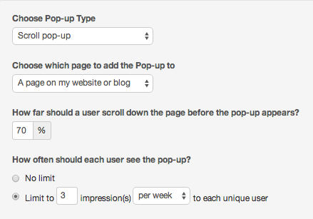
You’ll notice that I’ve set this Scroll Pop-Up to appear on a page of my blog. I’ll flesh out the pop-up with an ebook promotion (to drive email subscribers) and place it only on pages relevant to that ebook’s content.
I’ve set it to appear at 70% of the way down my blog’s page, meaning the reader is well into the article, but not quite finished. This means that if they aren’t into the ebook I’m promoting they’ll likely remain on the page to finish the content.
I’ve also set it to appear 3 times per week per unique visitor, an amount I’ve tested heavily in the past and found works best for our readers. I recommend you do the same before going ahead.
4. Entry Pop-Ups
Entry pop-ups are one of the most underrated (perhaps because they’re one of the most dangerous) pop-ups available to online marketers like us.
They appear as soon as a landing page or website has loaded, essentially blocking a visitor from seeing the page they wanted to see until they’ve engaged with it.
This means that entry pop-ups appear before anybody has seen your page’s image, read its USP, or had the value of engagement communicated with them in any way.
Sounds sketchy, doesn’t it?
The thing is, entry pop-ups are actually awesome, if you use them right.
Here’s what I recommend;
- Run an online-exclusive contest or promotion (50% off the first month’s subscription to your tool, for instance).
- Keep this exclusive contest close to your chest, promoting it less than you have in the past.
- When website traffic comes to your main page and travels through your tools, direct them towards your pricing page (as you would normally).
- Instead of allowing your website visitors to see your regular pricing page, implement an Entry Pop-Up that appears as soon as they arrive on the page.
- Have your Entry Pop-Up read something like “Limited time only! Get 50% off your first month’s subscription to [your tool]. Promotion ends midnight tonight!” with a “Click here to get your discount” button clear and bright on the bottom.

Now I get that this sounds sales-y, and those of you more sedate, conscientious business owners and managers may be a bit skeptical of this tactic.
I get it, I was in the same boat as you only a couple weeks ago. But (as I said above), pop-ups work, and once you get over that squeamishness and the leads and sales start rolling in you’ll be fine.
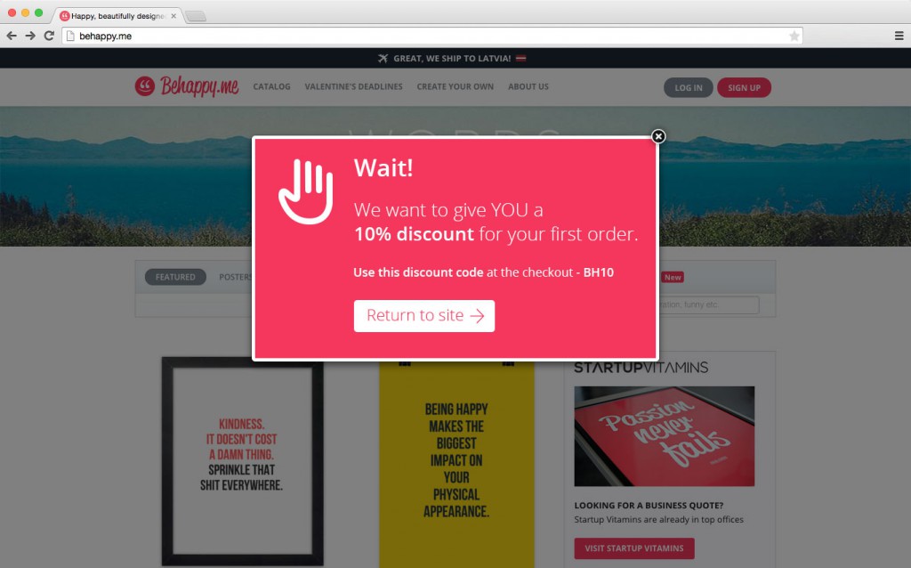
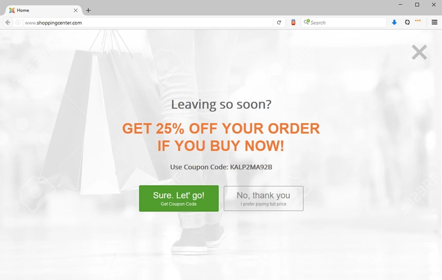
5. Exit Pop-Ups
The most common type of pop-up, exit pop-ups use “exit tracking” software to calculate when a visitor to your landing page or blog is planning on bouncing.
Exit Pop-Ups utilize mouse-tracking (yes we’re getting a bit advanced here, friends) to measure cursor directionality and velocity, measuring (with impressive accuracy) when your traffic is about to close the tab, open another one or hit the “back” button on their browser.
And it interrupts them.
An Exit Pop-Up appears just as your visitor is about to bounce, encouraging them to convert on (perhaps) a CTA button they missed or an offer they didn’t know about.
Consider that when your blog readers are absorbing your valuable content they’re focused solely on that task. They’re not, for instance, looking around the rest of your page, checking for links to your ebooks, other articles, or a product demo. They’re reading, not buying.
That doesn’t mean they don’t want to convert or aren’t interested in subscribing to your top tips, tricks, and exclusive offers. It simply means they were focused on something else when you were giving them the option.
Exit Pop-Ups ensure they’re paying attention.
Here’s what I recommend:
- Place your Exit Pop-Up on your product landing pages and lead-generation pages, as well as blog.
- Have different pop-ups for each page: offer a free demo for your product pages, an “Are you sure? pop-up for your lead generation pages and an ebook promotional pop-up for your blog site.
- Ensure you’re not spamming your readers or visitors with an exit pop-up every time they visit your site. Test your pop-ups appearing a maximum of three times per week.
- Ensure you’re not spamming existing leads or clients with your pop-ups, as nothing causes an unsubscribe faster.
- If you need some inspiration, check out these examples to see how to create a good exit popup.
The crux of this entire exercise is that you need to test your pop-ups. Few pop-up providers allow you to A/B test your business’ pop-ups right off the bat, so shop around for the one that suits you best.
15 Types Of Pop-Ups You Can Use
We’ve outlined five main types of pop-ups that you can add to your website. Within these pop-up formats, all kinds of different types of pop-ups and pop-up examples exist. Here are ten different specific pop-up types that you can try out.
1. Lightbox Popups
Lightbox popups are one of the most popular types of popups. You’ve probably seen these on many different websites that you’ve visited.
These popups appear in a smaller window over the web page that you’re browsing. The webpage in the background goes darker, and the large popup over this is bright and attention-grabbing.
Lightbox popups are effective because they’re impossible to miss. If you want to continue browsing the webpage, you have to close them.
2. Floating Bar Popups
These popular popups are a bit more subtle but still super effective. They appear in a floating banner, usually at the top of the screen.
Just like any kind of popup, you can time floating banners to appear on the screen at certain times. This could be as soon as someone lands on your site after they’ve spent some time on your page, or after they have performed an action.
Floating banners blend more naturally into a site, but they are still very eye-catching. These are great popups for promoting a limited-time discount or special offer. These popups are often combined with a countdown timer to achieve a greater effect.
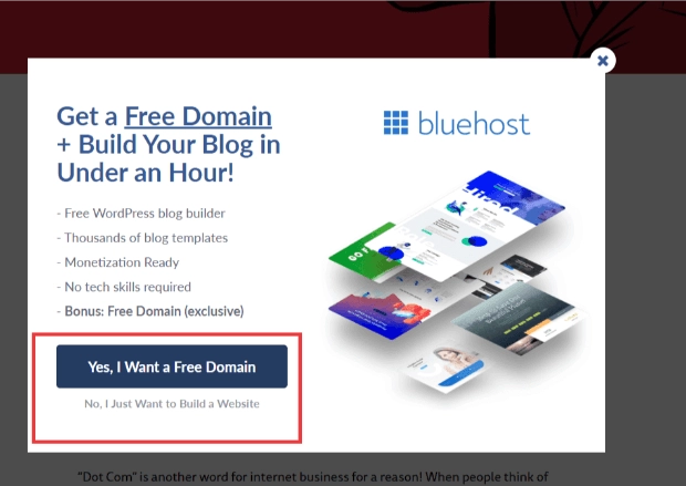
3. Yes/No Popups
Yes/No popups can take various forms. They could be exit popups, lightbox popups, scroll-down popups, or more. The important thing is that they offer two clear options: one yes and one no.
These don’t literally have to say yes or no, they just need to have two CTA options. One option performs the task you want the user to do, the other one closes the popup.
These popups are effective because you give your website visitors the choice to easily cloe the popup if they’re not interested. You can also optimize your popup design and CTA wording to make your “yes” button a lot more enticing than the no. For example:
4. Yes/Yes Popups
Yes/Yes popups are similar to yes/no popups, except for one major difference – there is no option for a “no”. This is achieved through strategic, clever CTA wording. The visitor can still close these popups by clicking outside of them or pressing the exit button.
Yes/Yes popups have two buttons that lead to the same landing page. They just have slightly different reasons for taking the visitor there. Here’s a great example of this:
These popups are effective because they double your chances of the visitor performing the action you want. You give them two different chances to click on your CTA, both for different reasons. This means that even if they don’t want option 1, they might still click on your link for option 2.
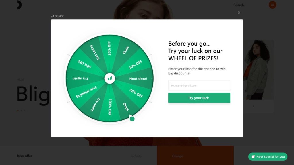
5. Gamified Popups
Gamified popups are really fun, they turn a regular popup into an interactive game. This is often seen in the form of a “spin the wheel” type game.
Gamified popups are great because they grab a lot of attention. Even if the user isn’t interested in the CTA at first, they might want to play the game just for fun. Then, depending on the outcome of the game, this could give them a reason to follow an action.
With a gamified popup like a spin-the-wheel game, you also offer plenty of different options to your visitors. And, when they play the game, the outcome they get feels more like a prize, and less like a marketing action. This is a great way to get visitors to follow through with something.
6. Fullscreen Popups
These are the most aggressive types of popups. As the name suggests, these popups take over the user’s screen, covering the entire window that they are browsing. They can close the popup, but it’s impossible for them to miss the popup.
If your popups aren’t achieving good results and you’re worried that your visitors simply aren’t seeing them, then consider converting your smaller popup into a fullscreen one.
7. Informational Popups
Most popups are designed to get the viewer to perform an action. Informational popups, on the other hand, simply exist to tell your visitor about something important. They don’ have a CTA or action button. Instead, the user simply closes them and continues their journey.
Information popups are a great way to communicate important information about your business (such as a change in opening hours) or to highlight the value of your business (such as reminding users about a sale on your website).
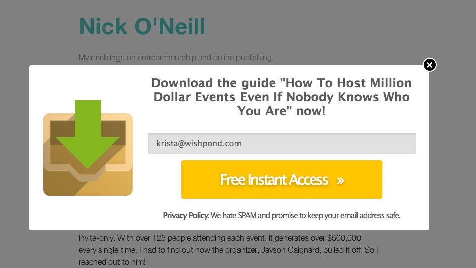
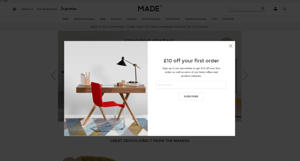
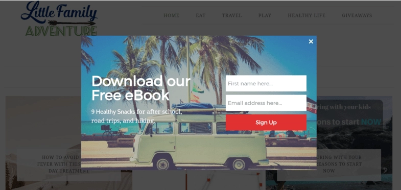
8. Lead Magnet Popups
Lead magnet popups are one of the most common, and effective, strategies used to grow an email list. These popups offer the user something of value, like an ebook or a course, that they can access by providing an email address.
Users need to fill out a form in these popups. Ideally, this is a short form with minimal entry requirements (such as name and email address). For lead magnet popups to be effective, they should clearly display the value of whatever it is they are gating.
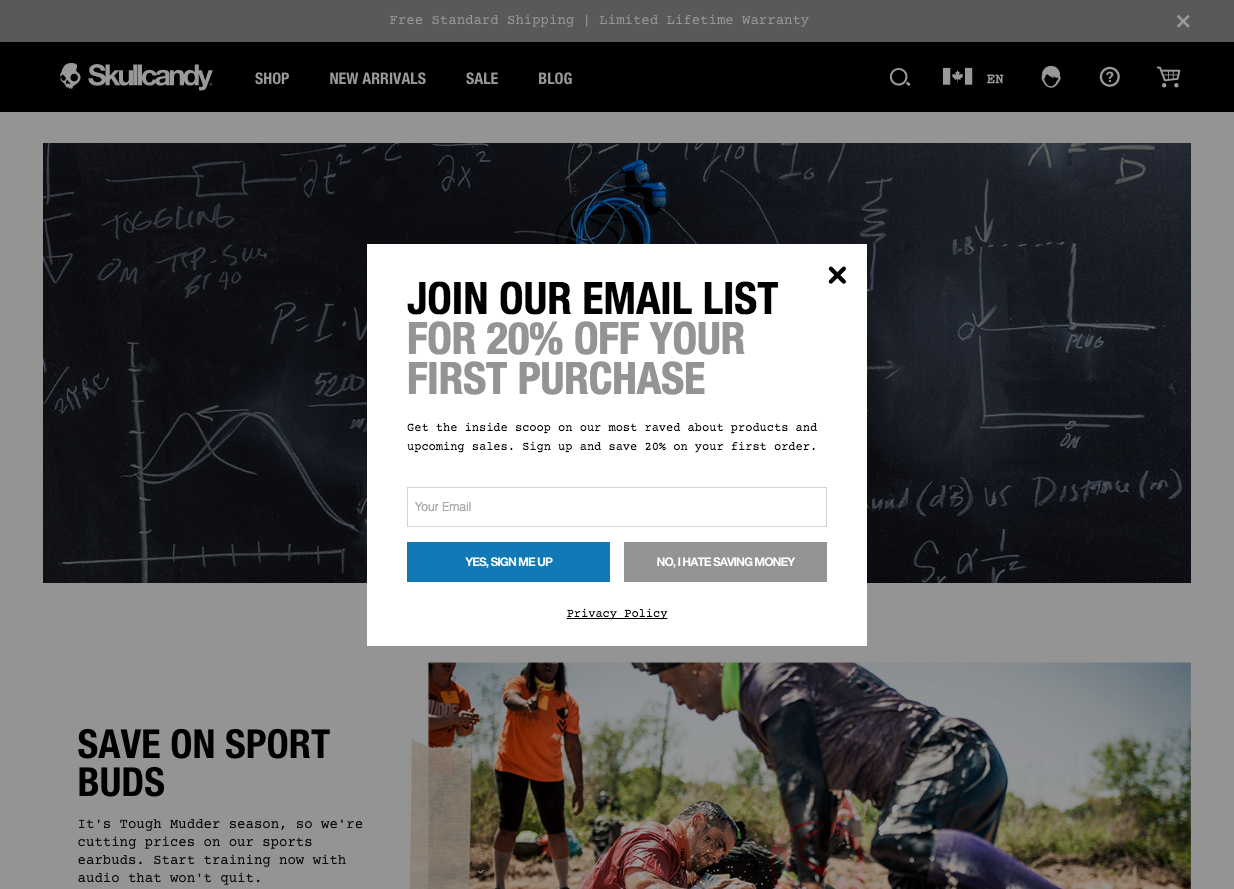
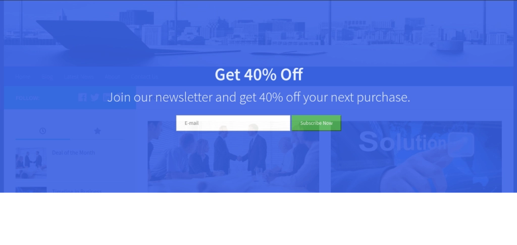
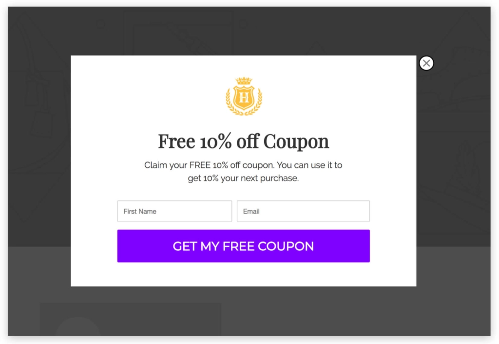
9. Coupon/Promotion Popups
These popups are an excellent strategy to boost sales and gain newsletter signups. They work by offering a discount coupon or special promotion (like free shipping or a free gift) that users can access by adding their email addresses. The reward is then automatically mailed to them.
These popups are great because they offer pure value to website visitors. They’re particularly useful for eCommerce businesses, as online stores can add strategic discount coupon popups on certain products.
10. Cart Abandonment Popups
Cart abandonment popups are an important strategy for online stores to deploy. These popups trigger when shoppers are about to abandon their carts. They will usually display some kind of special offer or discount to help the shopper complete their purchase.
This is a highly effective strategy for recovering lost sales and increasing eCommerce revenue. You can also run abandoned cart email and SMS campaigns to achieve the same effect.
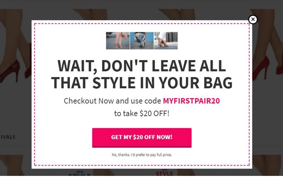
Image: Scarlettos.com.au
11. Webinar Registration Entry Popup
Entry popups put you in dangerous territory. They interrupt a visitor coming to your page – pretty damn aggressive.
However, done right, entry pop-ups can have some seriously impressive conversion rates – so long as you support your interruption. If you’re running a webinar, adding an entry popup is the perfect way to promote it. Just make sure that you highlight the value of your webinar.
12. Ebook Download Click Popup
This is a common popup strategy used for lead generation. Click popups (or “two-step signups”) cut out the need to send blog or landing page traffic to another page of your site. Click popups expedite the lead generation process, meaning more leads (faster) for your business.
They also cut down on the need for extensive copy and landing page optimization, as they’re far more concise and don’t require anywhere near the energy a landing page does.
Here’s an example of an old clickpop up that works:
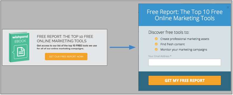
Why does this click pop-up work?
- The click popup puts a conversion opportunity in front of your reader while they remain on your blog page instead of sending them to a whole new tab and landing page. This means possible leads have less time to think, meaning more leads for your business.
- The copy is consistent across both image link and click popup, ensuring people who click on the banner image quickly and easily know they’re downloading the right piece of content.
- The popup includes a short and efficient benefit ilst, a USP and a CTA (the most essential parts of any lead or sales-generating page).
- The banner includes an eye-catching image, which contrasts with the text-dominated bottom of a blog article and draws attention.
13. Free Demo Exit Popup
An exit popup is an incredibly effective lead generation tool. They work by placing a required action in front of your reader, insisting that they focus on it. This is what makes them so great for promoting demos.
Here’s the breakdown of exit pop-ups:
- Your blog’s readers are focused, intensely, on your content.
- When people are focused on a single, specific task or point, they experience something called “inattention blindness”, which basically means they don’t see something obvious (like a big orange CTA button) when they’re focused on something detailed.
- Popups, particularly exit pop-ups, break through inattention blindness by coming between a reader and their focus point.
- That means that a reader who bounces (not because they aren’t interested, but simply because they genuinely don’t see your “Ask”) may, instead, convert.
14. Blog Subscription Scroll Popup
These popups work best for email subscriptions, as they’re less of an ask and they can be delivered to people at the moment they’re most interested in your valuable content (an email-gated ebook, whitepaper, infographic, report, etc)
Scroll popups are my go-to for email subscribers, as they only show to readers who are invested enough to read at least 70% of a blog article. This is also why it’s essential you don’t place a scroll pop-up at the beginning of your page (because your reader hasn’t gotten value from your content yet) or at the very end (because many readers will leave before scrolling to the very bottom of a page).
15. Industry Report Timed Popup
Timed popups are a bit more tricky than scroll popups, but can be perfected through testing and tweaking.
I recommend you head over to your Google Analytics for your blog page and check out the average visit duration on your articles. Set your timed popup to appear anywhere between 10 and 20 seconds before your average reader tends to leave.
These popups are excellent for offering valuable content that dives deeper into your blog topics, such as an industry report.
Conclusion
Hopefully, that’s given you a solid understanding of the website popup and the different ways you can add it to your page.
Yes, pop-ups can be an annoying part of online marketing and if they didn’t work so damn well we never would have invested so much time and energy in creating a tool that makes them easy for you to integrate into your marketing strategy.
They can be used to capture leads, increase sales act as a way to get answers to survey questions, and more.
But they do work well, so there ya’ go.
Ready to get started with popups? Check out Wishpond’s popup builder tool to get started.
P.S. Wishpond’s Facebook Contest Apps make it easy to create sweepstakes, photo contests, Instagram hashtag contests & more. Looking for inspiration? Check out 25 Creative Facebook Contest Ideas You Can Use Today.