
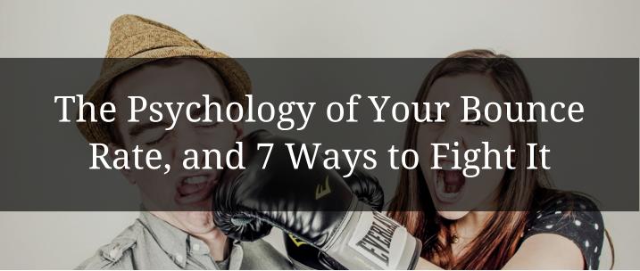
Bounce rates got you down?
Want to bump that conversion rate up and kick that bounce rate down a notch?
You’ve come to the right place.
This comprehensive article will give you the psychology behind your website’s bounce rate as well as 7 advanced strategies that can drop that bounce rate down. I’ll give you real-world examples of landing pages and websites utilizing those 7 strategies as well as break many of these points into bite-sized, actionable pieces you can use to optimize your own sales funnel and fight the bounce fully armed.
Let’s get rolling!
Table of contents:
The Psychology Behind your Website’s Bounce Rate
A bounce is officially defined as when a visitor to your website only visits a single page before leaving – not travelling deeper to your product pages, about us pages, pricing pages or your blog.
Several of the 7 strategies in this article will tackle that type of bounce, the others will tackle the other kind of bounce: the bounce that occurs when someone visits your landing page and leaves before converting.
Both are “bounces”, and both the bane of a digital marketer’s existence.
But why do they occur in the first place?
There are as many reasons for a bounce as there are visitors to your page, but I’ll try to break it down anyway (and forgive my simplification).
There are two primary reasons at the heart of all bounce rates:

Now what do I mean by those?
In the case of the first one, I’m talking about those pages that…
- Are visually unappealing
- Ask too much of their visitor
- Aren’t focused on conversion or navigation
- Throw too much information too fast
In the case of the second (not providing what your visitor was looking for), I’m talking about those pages that…
- Don’t offer clear value
- Don’t offer enough information
- Are incorrectly linked
- Include a prohibitive element (like price or feature)
The seven strategies I give in this article address each of those bullet-points, so read on to learn how to combat your frustrating bounce rates.
Now, “visually appealing” is an incredibly relative term. Colors, fonts, formatting and design are all elements which different people respond to in different ways. But a huge amount of this comes down to psychology.
I took a look at the psychology of color in an article I did about Facebook Ads. If you’re interested about the connotations and subconscious meaning behind different colors, be sure to check it out.
I also examined the science of a successful landing page a couple months ago, taking a look at how an optimized landing page can focus people’s attention, encourage a conversion or create trust, all without your visitor being conscious of it happening.
Check those articles out, read these next 7 ways to fight the bounce and test your pages to hell and back. Once you’re done with that you’ll be well on your way to an optimized website and landing page.
How to Decrease your Website’s Bounce Rates #1: Design
The general design of your page or website has a huge influence on people’s first impressions.
Design is the difference between this monstrosity with 7,000 individual links, badly contrasting color and an overwhelming amount of stimulus…

And this…

Both are auto shops based out of New York, and both are vying for business in the same industry. But what’s the difference?
Design.
Now, we have to appreciate that liking or disliking a website is heavily influenced by the subconscious, cultural associations, individuality, and other elements difficult to cater to. As a result it can be hard to anticipate or understand what will (or is) actually resonating with your visitors.
That’s why it’s wise to keep a few universal best practices in mind.
- Cut out distractions : Your message should be front and center, and there should be little else (on each section of your page) that distracts from the focus point. Prioritize three or four elements of your page and eliminate all non-essential links, images and text that detracts from focusing on those elements.
- Remember the “F” : People who come to your page read from top down, and from left to right. That means that your primary focus points (your USP, title or headline) needs to be top left. Your secondary focus point needs to be top right, and your tertiary (yeah it means third) focus point should be middle left. These are the results from hundreds of eye-tracking case studies, so believe it!
- Use attractive, friendly colors: Check out my articles specifically about color to learn more, but (for now) just know that blues and white (with a yellow or orange CTA button) is probably a good call to calm your visitors, appear professional, and keep them from bouncing immediately.
- Segment your content sections: This makes the information on your pages palatable. It focuses attention on a single area. This can be done both with encapsulation (“encapsulating” your information into boxes, colors, or fonts) and white-space (putting space devoid of text around your focus points).
Here’s an example:

Also notice the simplicity of this page. Granted, it would have a USP or headline above the video, but apart from that this image shows pretty effectively the structure of an optimized page.
Something to note: In modern web-design, it’s also essential that the layout of your website look just as appealing and optimized for user engagement on mobile as it is on desktop. I recommend you either hire an accomplished web designer to do this, or engage with a software provider with templates that are already optimized for mobile.
How to Decrease your Website’s Bounce Rates #2: Collecting the Right Traffic
Designing your website or landing page for your targeted audience is step one.
Step two is driving your targeted audience to your website or landing page (makes sense, huh?)
Optimizing your website and landing pages for SEO is vital to the success of your business online. And there are two options when designing your website for a targeted audience: go broad or go specific – and they both are about SEO.
Going broad means fighting tooth and nail with your competitors for the top spots on Google.
Here are a few ways you can do that:
- Create more content, so every time someone asks a question of Google that’s related to your product or service, your content pops up (blog articles, industry reports, case studies, ebooks, webinars, podcasts, videos, presentations, white papers, etc, etc, etc)
- Focus on your page’s meta-tagging, load times, and link-building efforts so you’re doing it all better than your competitors

Going specific means finding your niche, and catering to it in every way.
Here are a few ways you can do that:
- Targeting the hell out of your online advertisements, ensuring the people who click your ads are genuinely interested in what you have to offer
- Creating multiple landing pages with specific content subjects and keywords for each specific segment of your targeted market
- Using language that resonates with your target market (consider the ambiguity of a car advertisement’s message versus the specificity of a company making and selling computer hard drives)
How to Decrease your Website’s Bounce Rates #3: Videos
Videos are valuable not only because they put a personal touch on your landing pages or website, but because they inherently increase the amount of time people spend checking out your pages.
Think about this factoid (really think about it!): Visitors to your site spend, on average, three seconds making the decision if they’re going to stay or leave. If they stay longer than three seconds, the chance of them converting increases exponentially; if they stay less than three seconds, the chance of them coming back is virtually nil.
So what strategies can you come up with that would encourage a visitor to spend at least three (maybe even five!) seconds just looking at your site?
How about an auto-play video?
What those extra five seconds give you:
- A visitor who knows more about your business’ tools and what you have to offer (because you’re telling them).
- A visitor who has more time to look around your page (even if they don’t scroll), seeing the value of your USP and benefit list, the simplicity of your entry form, or the glowing recommendations from your customer testimonials.
- A visitor who trusts your business (they can’t help it) more because they’ve seen a representative face to face. This makes your interaction far more personal and, therefore, trustworthy.
- A visitor impressed with the professionalism of your video (or simply the fact that you have the capabilities and talent to make a video that doesn’t suck – which is hard).
Here’s an example from a webinar that Wishpond just wrapped up:

Something to Note: Self-loading multimedia will slow down your page’s loading time (negatively influencing SEO). Be sure you check your Pagerank (and traffic) against the conversion increase caused by your video to see if it’s worth it.
How to Decrease your Website’s Bounce Rates #4: A Smiling Face
The image you choose for your website or landing page is the first thing that people see when they “meet you” online. Imagine the design of your website to be the clothes you wear and the neighborhood you’re in when you meet someone. This is the stuff that people notice from far away, and it’s these variables that help them decide if they want to cross the street to shake your hand.
Your website’s image is your face, and the right image means that face is a smiling one.

And here’s where all other content marketers would give you “5 image ideas to increase your conversion rates”. They’d talk about the value of a smile and how stock photos can actually decrease trust and increase your bounce rates. Now, while both those things are true, beyond that, I can’t help you much.
Your website’s image needs to be tested. I can’t tell you what image will resonate with your target market. I can tell you it’s an incredibly important element, but can’t give you the images that will work for your business.
Instead, you need to A/B test different images based on where your visitors are coming from, their demographics, your products and offers, and the overall layout of your page.
How to Decrease your Website’s Bounce Rates #5: Exit Pop-up
Exit pop-ups put a yes or no question in front of your website traffic, requiring them to make a decision.
That simple fact is at the heart of why they work. When someone bounces from your landing page or website, it’s not necessarily because they aren’t inclined to engage, but simply because it’s so much easier to leave.
An exit pop-up, however, requires them to make a decision, and, as you know, saying “No” to something offered is far, far harder than it is to simply walk past it.
But it’s not really about making someone act, but rather giving them the opportunity to say yes or no. Consider that the people reading your blog are interested in the content they’re reading. It’s likely that they’ll be interested again. However, unless your “Subscribe Here” CTA button is bright red, huge, and in the middle of the screen, they may not even be aware of it.
An exit pop-up reminds them of the possibility, and asks they make a conscious decision about whether or not they want to subscribe to more awesome content from your business.
Here’s an example from DukeO:

How to Decrease your Website’s Bounce Rates #6: Interlinking
If your landing page or website isn’t delivering everything your visitor needs to know, they may bounce to look for it elsewhere.
In the example below, Kissmetrics runs the risk of being overly focused – encouraging conversions with a simple USP and social-media-based “Ask” – but perhaps sacrificing leads by not including much information about their product or service.
As a result, they include a link to a “Three minute overview of KISSmetrics” thereby reducing their bounce rates.
Check it out:

Interlinking your homepage, product pages and pricing pages is essential to retain traffic within your website.
However, it’s equally essential that you DON’T interlink when creating your campaign-specific landing pages. Any links other than your CTA on your landing pages will decrease conversions.
How to Decrease your Website’s Bounce Rates #7: Copywriting
No matter what your message is, the way you write it matters when combatting a frustrating bounce rate.
Your website or landing page visitors need to understand what you’re offering, that the thing you’re offering is relative to them, and how it benefits them. And that all requires a bit of copywriting.
Remember how I said that your page’s design was the clothes you wear and your page’s image is the face you have? Well your copywriting is the thing you say when you meet someone. Do you want to reach a hand out and, with a smile on your face, say “Hi! It’s lovely to meet you. Can I help you with something?
Or do you want to mumble something inaudible?
Here’s a few of the most important copywriting rules to remember when combating your bounce rates:
Make your Message Clear:
- Large fonts: Contrasting fonts make your focus-points more obvious.
- Bullet-point Lists: Easy-to-read and skimmable, bullet-point lists are awesome for value points and benefits
Long Paragraphs are Bad: I mentioned this briefly before, but your website needs to be easily readable, palatable, and draw its visitor to read more information, get more value, and engage. Long paragraphs don’t do that. Instead, they bore your visitor, pushing too much information too fast. Use bullet-points, single sentences, and different font sizes to direct attention and communicate concisely.
Subheaders are Good: Neil Patel is the king of this. His product pages encourage readers to continue scrolling with different sizes and colors of font, and (above all) relevant subheaders that draw the reader in and keep delivering value until they’re satisfied.
Benefits vs Features: You want your message to resonate with your visitor, so put it in terms they understand and value. Rather than talking about your product’s features (1.84 teraflops), talk about the lightning speed users can’t get anywhere else. (That is, unless, you’re creating a “Tech Specs” page designed for your technical audience, in which case, jargon it up!)
Make it Viewer-Centric: Focus on providing your visitor with value rather than talking about what you can do. Consider words like “get” and “see” rather than commands (“get the free ebook!” instead of “download our ebook now!”
Conclusion
Okay that was a tad exhausting, but we’ve done it. We’ve gone through the psychology of your page’s bounce rate and given you the seven best ways to combat it. Hopefully you learned something.
Remember that fighting the bounce is as much about testing and tweaking as it is about implementing the best practices. An exit pop-up may not work for your business (though it definitely is for ours). Or it may work on your blog but not on your product pages. An image of a smiling customer may work fantastically on your pricing page but the same image may decrease conversions when you put it on your “about us” page.
There are many awesome A/B testing tools you can use out there to optimize your landing pages and website. Shop around and see which one works best for your business (I am, personally, quite partial to Wishpond, but that’s just me).
Further Reading:
- Bounce Rate: What It Is and How to Solve It with a Simple Survey
- 9 Things You Can do to Decrease Bounce Rate on Your Blog
- The Science of An Optimized Landing Page
- The Psychology of a Successful Facebook Ad
- The Complete Guide to Landing Pages (Ebook)
- 5 Landing Page Conversion Killers