

Website popups are one of the most effective ways to convert your inbound traffic into valuable leads for your business. There’s no debate.
You might say, “But popups are so annoying Jordan, that can’t be!”
If you’re spending time and money, building a stunning website to attract your target audience, you’d like to do the most you can to see a ROI, right?
Let’s imagine this scenario…
You’re a bike store owner.
A prospective customer, Mike, is in the market for a new road bike. He won’t spend a dollar before he does some research, so he heads to Google to search up the top 10 best road bikes on the market. Mike lands on a website which ranks their 10 favorite road bikes and, from there, clicks a link to your website for more information about one bike in particular. He navigates around on your site, reads a bit of the information you have and leaves.
A couple months later his bike finally breaks down and he purchases a new one and doesn’t even consider your business. Interaction over, opportunity missed.
As a result of this lost business you can’t feed your family with that sweet bike revenue, they resent you and have to live in a van down by the river — all because you didn’t use a website popup.

Mike, being the savvy shopper he is, wanted to shop around and see what road bikes were out there. When he arrived on your site, he was only focused on the bike information and nothing else. There was nothing set up to prompt him to come back when he was ready to make a purchase.
If there had been a popup offering him 10% off his first purchase, for example, you would’ve had a chance to capture his information and the prospect of continuing the bike purchasing conversation further.
Mike would’ve had an extra incentive from the discount to buy from you as well as prompts in his email inbox to remind him that your store exists.
When he was ready to buy, there would have been a far greater chance that he would claim that discount or consider shopping with your store before going elsewhere.
No van down by the river.
That’s the power of using a popup on your website.
It’s no secret that we at Wishpond are fans of the almighty website popup. That’s why for this resource I’ve scoured the internet to pick out 32 of my favourite popups from some of my favourite brands, to help inspire you and fire up your lead generation strategy.
I’ll explain why the offer, communication and design makes each popup effective for the brands that employ them.
Let’s get into it!
Hold on, what types of popups are there?
- Click Popup: Different from the other popup types below, click popups are an option for your page’s links. Instead of directing your visitor to another page, a click popup can present something like a form right on the spot. Click popups work well because they decrease the chances of your visitor leaving after they’re directed elsewhere. Read our article “How We Doubled Blog Lead Generation with Click Popups” for more.
- Scroll Popup: Scroll popups work by “popping-up” when your visitor has scrolled down a specific amount of your page. Once they’ve explored 50% of your blog post, for example, you might ask them to subscribe to your email list.
- Timed Popup: Depending on your business (many affiliates have found more success with a 10-15 second popup), timing your popups can have a huge effect on conversion rates. Most case-studies agree that the optimal time for your popup is less than or equal to 60 seconds after a visitor has entered your page. Test this for yourself.
- Exit Popup: Exit popups show themselves when a visitor moves their cursor towards the close button on the window or tab. It is a last ditch effort to persuade visitors to continue exploring the site or finish their checkout process. Exit popups are commonly used to decrease what ecommerce folks call “shopping cart abandonment.” An offer like an extra 10% off to complete your purchase is one example. You want to be sure that when you’re in your form builder to leave room for an offer.
- Entry Popup: This type of popup appears as soon as a visitor arrives on your page. If you’d like to present something like a promotion or an exciting offer right when a visitor arrives, an entry popup is your best friend. An entry popup can be used to alert a visitor of your summer sale or a brand new ebook before they explore your website.
32 All-Star Popup Examples
Backlinko
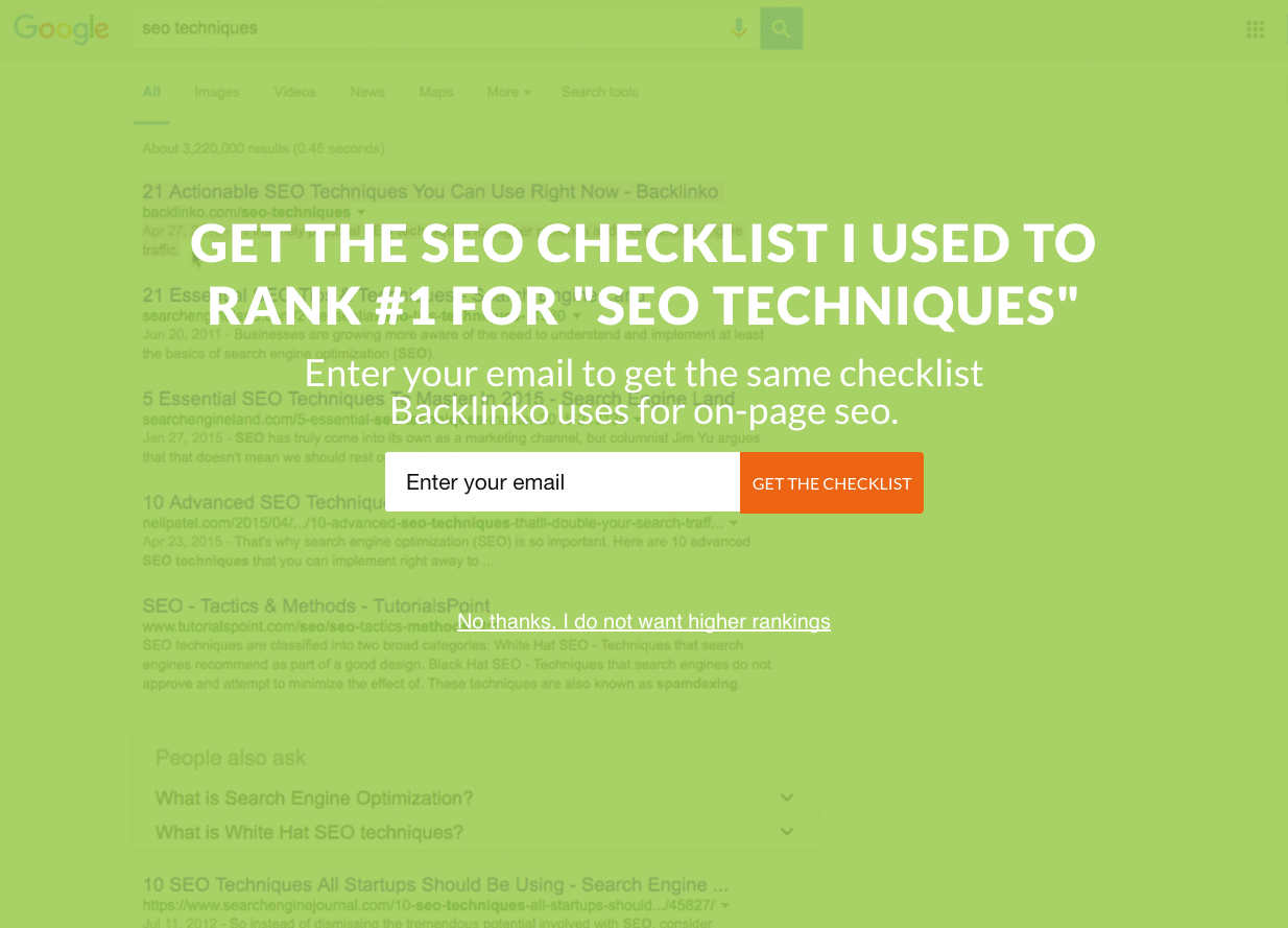
Why we chose this popup example:
Everyone’s go-to website for SEO strategies, Backlinko employs a full screen landing mat. The bright colors and benefit-oriented headline grab your attention and promises to present the same strategy they use themselves. The negative call-to-action (CTA), “No, I do not want higher rankings” pushes visitors to signup and receive the checklist.
Bench.co

Why we chose this popup example:
Bench, a rising fintech startup, uses a popup to grab the attention of their international visitors. We love their use of friendly communication and a promise of real-time updates in their popup. It’s a smart way to collect contact information and keep all their visitors in the loop until they’re ready to open up internationally.
Aweber
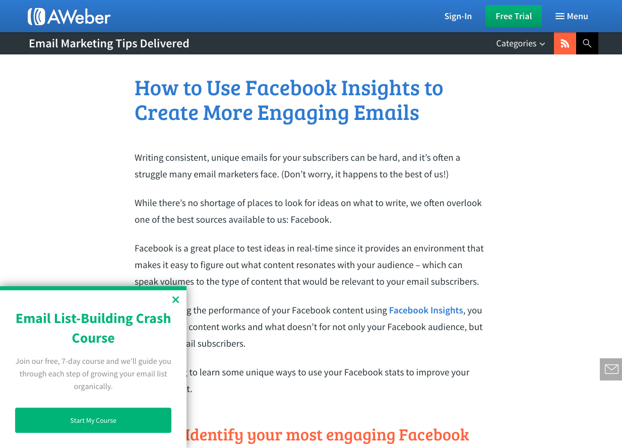
Why we chose this popup example:
We’re big fans of the email experts over at Aweber and the sidebar popup they use to offer up their 7-day email list crash course. It’s a subtle way for Aweber to grab a visitor’s attention while they read the blog and offer up their valuable lead magnet. The CTA “Start My Course” is concise, specific, and begs to be clicked on.
Optimizely

Why we chose this popup example:
Optimizely, Wishpond’s A/B testing platform of choice, employs a footer popup on all of their value-packed blog posts. We love the way the scroll popup on the footer and grabs attention but doesn’t distract from the content. Their offer is overloaded with value and virtually irresistible.
Frank and Oak

Why we chose this popup example:
Menswear clothing giant, Frank and Oak, uses an entry footer popup to attract first time shoppers with a 15% discount. The eye catching color and light hearted copy make this popup an attention grabber. Frank and Oak use their popup to offer up value before their visitors begin their shopping experience – thereby increasing the chance of a final conversion.
Contently
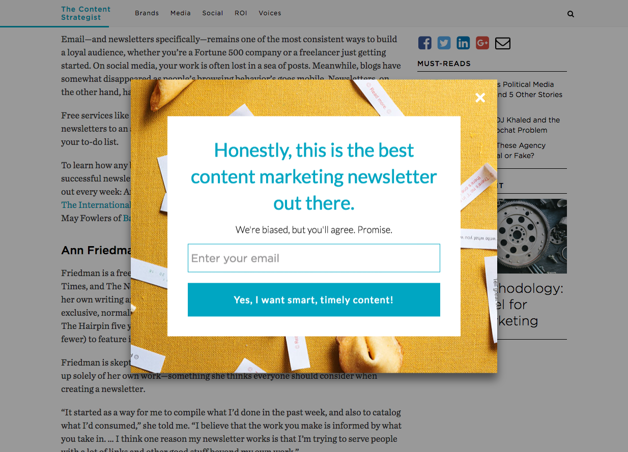
Why we chose this popup example:
The content experts over at Contently use a mega value proposition on their timed popup, “the best content newsletter out there.” They promise to deliver the goods in their email newsletter better than anyone can. The pleasing design and fun language make this popup a powerful lead collector in our eyes.
ConversionXL
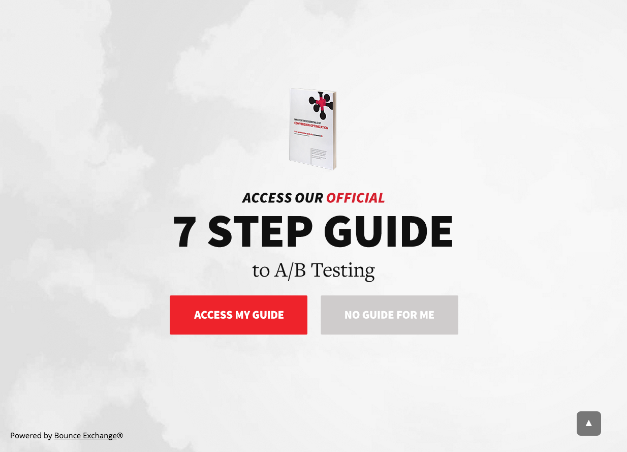
Why we chose this popup example:
Peep Laja and the conversion focused team at ConversionXL definitely know a thing or two about converting website visitors into leads. They offer up their 7-step guide to A/B testing in an exit popup landing mat. The minimal design and info-packed, 7-step guide is sure to prevent anyone from leaving ConversionXL without leaving their contact info.
Convince&Convert

Why we chose this popup example:
It makes sense that one of the best web resources for conversion rate optimization content uses a brilliant overlay style scroll popup. Convince&Convert asks, “Are you in?” to immediately grab attention and make their visitors think. If you’re a professional or aspiring digital marketer, you can join 20,000 other marketers and receive their newsletter. The offer and design make this one of the most tempting popups we’ve seen around town.
CoSchedule

Why we chose this popup example:
CoSchedule, the content-scheduling gurus and hosts of our favorite headline tester, use a fun landing mat to sign their visitors up for the best content marketing blog post alerts. The clean and minimal design and directional cues make it hard to resist signing up to receive awesomeness right to your inbox.
GearMoose

Why we chose this popup example:
GearMoose, the website that shows off the coolest gear around, uses strong photography to give their visitors a taste of what they can expect if they sign up.
Later

Why we chose this popup example:
Later, the Instagram post scheduling app, collects email subscribers and free trial users with both a scroll and sidebar popup. You can join more than 600,000 other Later users and receive access to all of the app’s benefits.
NeilPatel

Why we chose this popup example:
Neil Patel, the founder of KissMetrics, CrazyEgg and QuickSprout, shows off all the popup best practices in one popup landing mat: benefit-oriented CTA, value packed headline, and multiple points of social proof. Neil Patel has it all in this popup and shows why he’s a master of conversion rate optimization.
BlueApron

Why we chose this popup example:
BlueApron, the meal ingredient delivery service, entices subscribers with the latest recipes and cooking tips right to their inbox. Their timed popup uses salivating imagery to push the offer even further. We love this popup for the content offer and the mouth watering pictures that make subscribing hard to resist.
Esquire
Why we chose this popup example:
Esquire magazine knows their stuff when it comes to producing high quality content and uses it to their advantage in their exit popup. The funny communication and massive list of “75 movies every man must see” make this an all-star popup. You can either sign up for their email list or “stick to the latest Adam Sandler films” – it’s your choice.
Gilt

Why we chose this popup example:
Gilt, the discount designer retail website, uses its popup to gain more members. Once you become a member you get access to exclusive discounts on top designer brands. Instead of directing you to a sign up page, you can sign up right on the popup. The value proposition and simple access make this popup all-star worthy.
GrooveHQ

Why we chose this popup example:
If you’re a regular reader of the Groove blog like we are, then you know the level of value which they provide their subscribers. CEO Alex Turnbull and his team share everything they’re doing on their way to $500k in monthly revenue. Their compelling headline and simple offer make this entry popup overlay one of a kind.
HelpScout

Why we chose this popup example:
Why not join HelpScout, the popular help desk software company, and 72,558 subscribers to receive valuable content weekly? They use social proof in their timed popup and let subscribers know to expect two articles a week. No sales pitches, no games, and a one-click unsubscribe make this a simple and effective popup.
Indochino

Why we chose this popup example:
Indochino, the made-to-measure suit maker, offers up exclusive content, special offers, and style news to their email subscribers. If you’d like the latest style tips and first access to special promotions the Indochino popup was made for you.
JeffBullas
Why we chose this popup example:
JeffBullas, popular marketing blogger and one of the most influential personalities on Twitter, promises to turn your stale old blog into a money-making machine. Sign up and learn about the 5 tools he used to build a 400K monthly reader blog. The big bold headline and CTA make this popup hard to ignore and the tempting lead magnet take it to the next level.
NerdFitness

Why we chose this popup example:
Join the NerdFitness community of 298,725 “nerds” that love health and fitness. The communication on this popup is the perfect mix of nerdiness and humor, asking that you fight back against the “dark side of fitness.” You’ll receive 3 PDFs to kickstart your fitness journey and join a community dedicated to the nerdy side of fitness.
OldNavy

Why we chose this popup example:
Want to be email pals? Old Navy uses their popup to offer a whopping 30% off your purchase and exclusive access to discounts and deals. The fun and casual nature of the Old Navy brand shines through brilliantly in the design of this entry popup.
Onnit

Why we chose this popup example:
Onnit, the ever-popular earth-grown supplement and fitness company, is no slouch when it comes to branding and communication. In-line with their powerful branding, they have brand ambassador Joe Rogan on their popup to provide maximum impact — not to mention the additional 10% discount. p>
QuickSprout

Why we chose this popup example:
Neil Patel does it again, this time with his company QuickSprout. Say yes, sign up and let Neil teach you how to grow your business. The powerful value proposition shows why Neil is a master at converting his visitors — something that he’s also offering to teach you.
Reebok

Why we chose this popup example:
Reebok, the apparel sponsor of UFC and CrossFit athletes worldwide, continues to evolve and experiment with new products and initiatives. The offer is a mystery but if you’d like the latest Reebok news and promotions, this email list is your best bet.
Revolve

Why we chose this popup example:
This popup shows why Revolve is still one of the leading online retailers of apparel. The attention-grabbing headline and the 10% discount offer combine to create one powerful lead generating entry popup. Shoppers can explore the site and shop knowing that they have access to a special discount for first time buyers.
Sephora

Why we chose this popup example:
Sephora’s entry popup is meant to make life easier for their online visitors. Free shipping, exclusive offers, and stock checking is all important information that visitors need before exploring the website. It truly has never been easier with the help of this popup.
SkullCandy
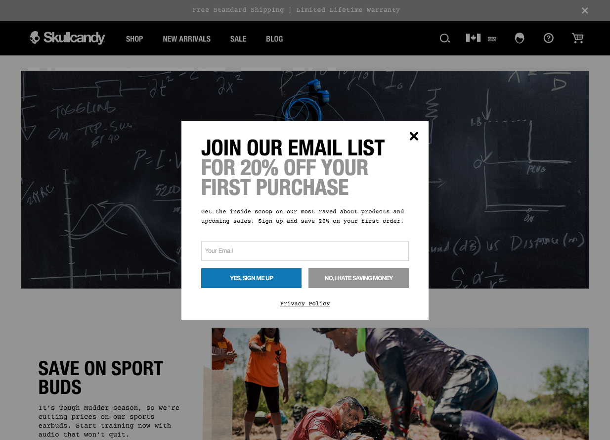
Why we chose this popup example:
Join the SkullCandy email list for 20% off before you begin your shopping experience. SkullCandy’s popup offers the inside scoop on the most raved-about products and upcoming sales. This popup packs a power punch for the brand and the shoppers… unless you hate saving money.
SocialMediaExaminer

Why we chose this popup example:
Take a page from one of the leading social media marketing websites on the web. SocialMediaExaminer (SME) offers up massive value in their popup with their free copy of the 2016 social media marketing industry report. They’re the go-to place for the latest trending social media news. Join 500,000 other social media marketers and get the inside scoop.
StuckInCustoms
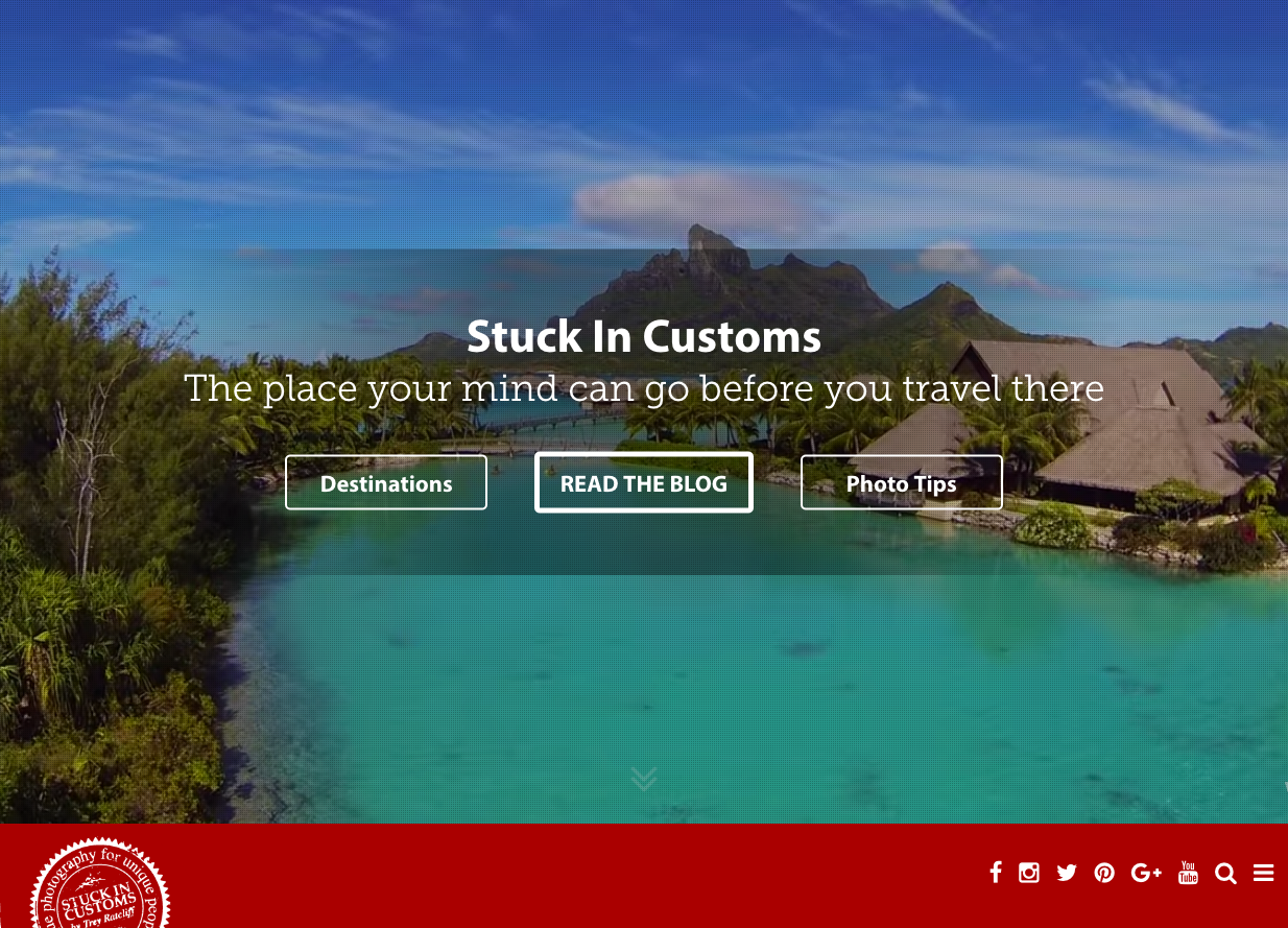
Why we chose this popup example:
Popular photography and travel blog StuckInCustoms directs you exactly where you want to go with their entry popup. They use their popup as a navigational tool for new and returning visitors. It speeds up exploration and gets visitors where they want to go. popup don’t always have to offer something, think of unique ways it can help you accomplish your goal.
UnderArmour

Why we chose this popup example:
Esquire magazine knows their stuff when it comes to producing high quality content and uses it to their advantage in their exit popup. The funny communication and massive list of “75 movies every man must see” make this an all-star popup. You can either sign up for their email list or “stick to the latest Adam Sandler films” – it’s your choice.
Uniqlo

Why we chose this popup example:
What’s not to love about Uniqlo’s branding? The Japanese-inspired clothing company keeps their branding in line right down to their website popup. The colors, large offer and bold typeface makes this popup hard to ignore.
WordStream

Why we chose this popup example:
Like the lead magnet it offers, this popup from PPC management tool WordStream grabs its website visitors hook, line, and sinker. The contrasting colors and the minimal design make the offer stand out that much more.
Zapier

Why we chose this popup example:
Want to be an app expert? If so, then you NEED to sign up for the Zapier newsletter. Get the leading marketing automation company’s comprehensive guides delivered straight to your inbox. Simple and effective, just like Zapier itself.
What We’ve Learned: Actionable Popup Takeaways
Popup Takeaway #1: Focus on Value Above Everything
The most successful marketing strategies hold value above everything else when it comes to their website popups. Popups can be a tricky strategy to get right as they must be effective enough to convert visitors but not annoying enough to shoo them away.
If your offer isn’t providing the value it promises you won’t see many opt-ins and plenty of unsubscribes.
There isn’t anything more frustrating for a visitor than submitting their personal information and not receiving what was promised.
If you’re offering an ebook that promises to teach you “how to improve your Instagram strategy,” it better come through on that promise.
Businesses need to create or find a unique selling proposition that compels visitors to subscribe.
- Ebooks
- Access to an exclusive community
- Free templates
- Free resources
- Discounts or promotions
If no one is subscribing or too many are unsubscribing, your offer or lead magnet is not valuable enough to accomplish its goal.
Popup Takeaway #2: Location Is Crucial
The type of popup you use on your website should align with your marketing and business goals.
Are you an ecommerce business aiming for more sales? Place your popup on the front page so your visitors are aware of your current promotions before they begin shopping.
Are customers leaving during checkout? An exit popup can lower your shopping cart abandonment by 3-5% percent.
Your popup should be used as a tool to grab the attention of visitors at the highest-converting point of contact. A company blog, for example, can offer up subscription to their email list in exchange for a relevant ebook or publishing alerts for their high value content pieces.
Depending on your type of business there will be places that popups will be most effective. Reevaluate your goals and see where a popup can give you a boost.
For more on optimizing your popup locations, check out my article Ranked: Best and Worst Locations for Your Call-to-Actions.
Popup Takeaway #3: Relevancy Goes A Long Way
Popups see a much higher conversion rate the more they relate to the content on the page.
When you’re exploring the recipes on BlueApron the popup will offer to send you recipes for free. If you’re reading about PPC tips on WordStream they’ll offer their ebook on 7 tips to decrease your PPC spend.
It’s all about context.
Take a look at the popups you are using on your website. Adjust the communication on the popup so that it references the content or topic on the page.
The more your language and positioning matches the content your users are reader, the more likely they will be to convert on your popup.
This is, at the heart of it, why click popups are so incredibly effective, and can to convert 100% better than landing pages.
Popup Takeaway #4: Test Your Messaging
This is a big one.
The language and communication you use on your popup plays a huge role on how well that popup converts your visitors.
How does well does the communication on your popup match your brand voice?
Does it communicate your offer in a way that is appealing to your target audience?
It helps to use a tool, like the Wishpond popup builder, which allows you to A/B test your popup. This way you’ll be able to see what kind of messaging is most appropriate for your audience and compare it against other language or strategies.
You’ll be able to test 2 headline variations against each other and see which appeals more.
The best marketers test as often as possible to improve conversion rates quickly.
Popup Takeaway #5: A Clear and Defined CTA Works Wonders
A clear and defined call-to-action can be the difference between a low or high-performing popup.
When the popup on your website displays and your visitor reads the text, the CTA needs to communicate exactly what is going to happen next.
The last thing you want is your visitor to be hesitant or confused before they’re redirected elsewhere. Your CTA must match their intent and expectation.
Imagine the scenario, your popup displays your offer to subscribe to your email list and download your free value-packed ebook. In your opinion, which CTA better matches your visitor’s intent, “Learn More” or “Download Your Free Ebook”?
The latter definitely matches the expectation and intent of your visitor better, therefore would command a greater conversion rate.
Audit your popups to make sure your CTAs match the intent and expectation of your visitors to maximize your conversion rates.
For more on optimizing your popup’s CTAs, check out “The 25 Best Words to Use in Your Call-To-Action Buttons” or “7 Landing Page Call-to-Action Formulas for Higher Conversions.”
Does your website use poups?
How are they performing for you?
What are your favourite tips for creating a high performing popup?
Weigh in below and share your opinions or tips!