
Looking to increase your conversion rate?
There are a number of things that can be optimized, from your headline text, hero images, videos. The list goes on and on.
But no matter what you change, at the end of the day there’s one thing standing between a user and conversion, and that’s your call-to-action.
If you’re curious about how to optimize this conversion gatekeeper, then look no further. We’ve scoured the web for 50 of the best call-to-action examples to date.
I hope you enjoy!
- What is a Call to Action (CTA)?
- How to Write an Amazing Call to Action
- Newsletter Call to Action Examples
- Product Call to Action Examples
- Free Trial Call to Action Examples
- Content Upgrade Call to Action Examples
- Webinar Call to Action Examples
- Charity Call to Action Examples
- Demo Call to Action Examples
What is a Call to Action (CTA)?
A Call To Action (CTA) is a prompt that you use in marketing campaigns to get your website visitor to take an action. CTA’s can include buttons, text hyperlinks, or plain text asking the user to take the action.
CTAs are typically found on website pages, at the end of marketing emails, and on social media, when you want the user to perform the action your campaign is trying to achieve. Think about buttons like “Shop Now” or “Subscribe” – these are CTAs.
The aim of a CTA is to make it easier for the user o take an action. You want to create a sense of urgency and make the user feel like they need to take the next step.
It doesn’t matter how much traffic you get to your web page, or how many emails you send out, if you don’t have a compelling CTA you won’t get many conversions.
How to Write an Amazing Call to Action
Whether it’s a landing page or a social media post, the whole point of your marketing campaign is to get people to engage and take an action. This is why a strong CTA is so important.
Writing an amazing CTA requires so much more than just saying “Buy”, there are various factors you need to take into consideration.
If you want your CTA to be as compelling as possible, consider these four things when you create it:
- Use strong action words: You want your CTA to be persuasive, inspiring people to take action straight away. Adding in words like “Now”, “Take Advantage Of”, or “Find Out More” all hold a lot of power. Make sure your CTA is actionable and demanding.
- Add value: Why should a person click on your CTA? They want to know what they’re getting out of it. This is why you should make your value proposition clear. Saying “Access Exclusive Free Guide” is far more compelling than “Download” because it highlights the benefits of downloading the guide (it’s free and exclusive).
- Provoke emotion: It’s always a good idea to try to provoke an emotional response in users. These CTAs are generally longer because you need to explain more in them. This could include a CTA like “Make your dream a reality” or “Feel healthier today”.
- Get creative: Whether we pay attention to them or not, we’re faced with many different CTAs all day. Traditional examples like “Buy Now” are so overused that they’ve lost their effect. Coming up with totally unique CTAs, like “Yes, I want in!” grabs attention and can be incredibly effective.
Top Tip: A/B test your CTAs. Most people won’t get their CTA perfect straight away, and experimenting with different options will help you find what CTA is most effective.
Newsletter Call to Action Examples
Here are some of the best call-to-action examples to help you increase conversions on your marketing emails.
Call-to-Action Example #1: Klientboost
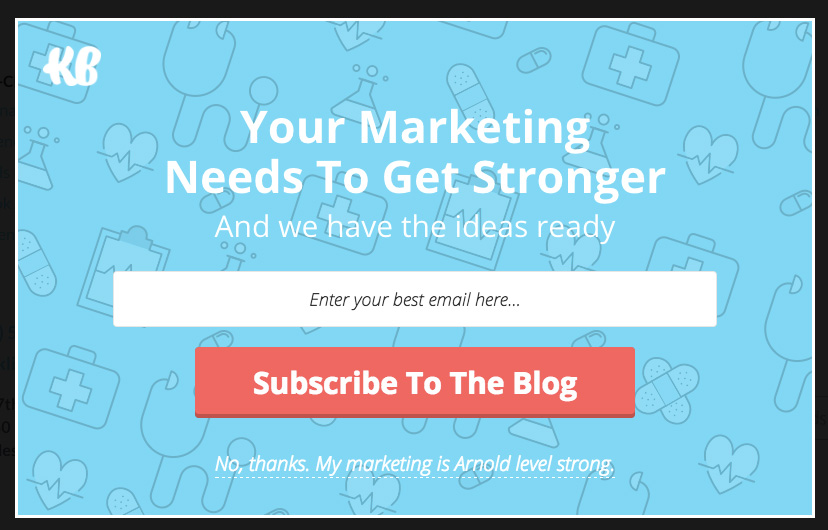
When it comes to call-to-action tips and tricks, there’s almost nothing that works as well as making your call-to-action state exactly what a user is doing.
For instance, you could say:
- Get My Offer
- Redeem My Prize
- Book My Demo
Notice how these are all based around the exact action that is happening once a user clicks on a CTA?
Klientboost does a great job of encouraging users to subscribe to their newsletter by not only providing a popup that’s designed well, but also by making their CTA clear, bold, and straight to the point.
Call-to-Action Example #2: Backlinko
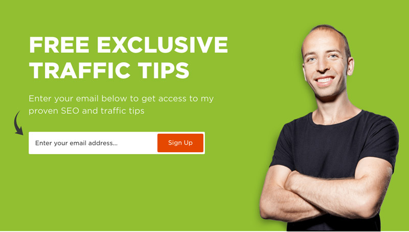
A big mistake rookie marketers can make when designing their call-to-actions is failing to add enough contrast between the CTA and the page background.
As a basic rule of conversion rate optimization, your CTA should always have a significant amount of contrast between itself and everything around it.
Notice how this example uses red, a color not seen anywhere else on the page as the CTA? Because of this, the CTA stands out boldly and commands a user’s attention.
Regardless of whether they have a directional cue or not, your focus will eventually go to that red “Sign Up” button.
Call-to-Action Example #3: ConversionXL
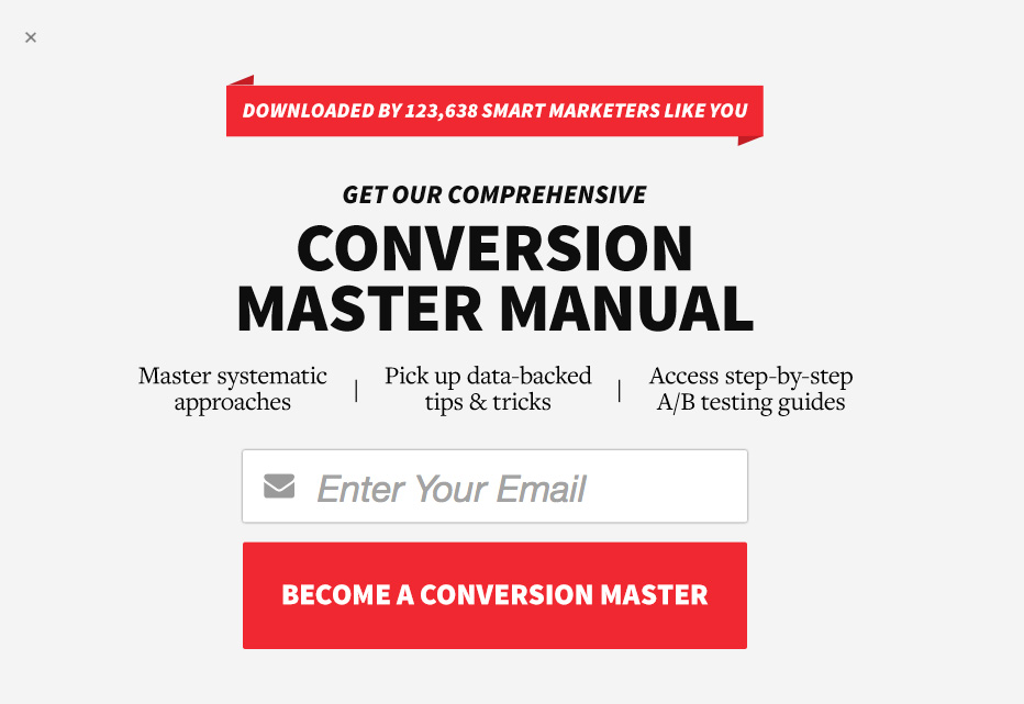
ConversionXL uses a bold red CTA that stands out from the rest of the page.
What’s interesting about this example is also how they managed to slip in a benefit-oriented statement into the CTA text.
Rather than choosing a simple CTA like “subscribe”, ConversionXL chose to go with “BECOME A CONVERSION MASTER”.
Because of this, when thinking about signing up for their newsletter, users are already primed for the value that they’ll be receiving and may be more likely to convert as a result.
Call-to-Action Example #4: Groove
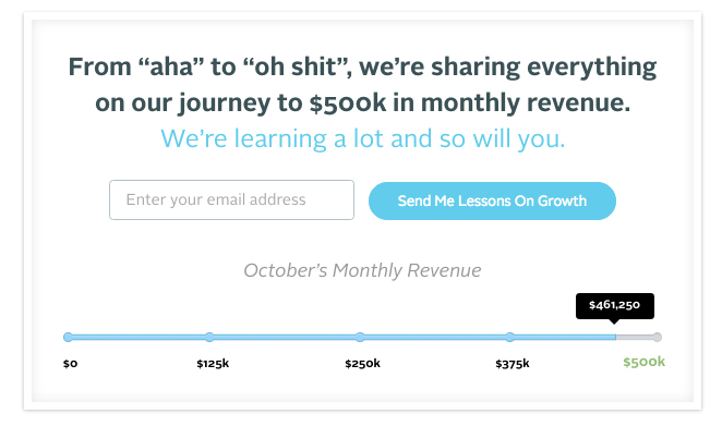
Groove places this call-to-action below their different blog posts in order to prompt users to sign up for their newsletter.
What stands out about this call-to-action is how clicking on it directly benefits the user: by sending them lessons on growth.
The entire form works to make users feel invested in the entire Groove experience by showing them a small chart of Groove’s progress, while also allowing them to signup to get updates in real time.
Call-to-Action Example #5: Blog Growth

Looking for a new a fresh way to position your content?
Try phrasing free access to your content upgrades as “free lifetime access”.
This is one way to increase the perceived value of your products, while also making the contents of the content upgrade more exciting.
Call-to-Action Example #6: Product Hunt

Product Hunt has a CTA banner that appears above their website prompting users to subscribe to the Product Hunt newsletter.
What’s great about this type of CTA is that it’s very non intrusive, allows users to close it if they want to (on the far right), and provides a clear value proposition of delivering new products to your inbox on a daily basis.
The CTA itself uses a high contrasting colour, and a simple subscribe button to convert users.
Call-to-Action Example #7: Nerd Fitness
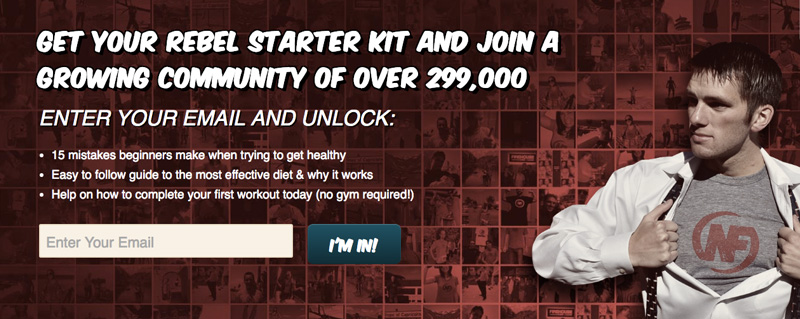
Nerd Fitness showcases a banner on their website that prompts users to sign up for their fitness newsletter.
What’s interesting about this banner, is that it frames joining their newsletter as a way of “unlocking” a number of different resources.
They also do a great job in using social credibility to encourage users to join by stating that you’ll be joining a growing community of over 299,000 like-minded people.
The CTA in this example is also simple and straight to the point with “I’m In!”
This is an action-oriented and easy way to get people excited about signing up.
Call-to-Action Example #8: Problogger

There are a number of factors that go into the psychology of conversion. In the case of this example from Problogger, we see the use of language within the call-to-action in order to emphasize a first-person action.
Rather than stating “Get Your Blog Post Prompts”, they rephrased it to say “Get My Blog Post Prompts”.
This subtle change can help increase the perceived ownership of the gated content by simply changing “Your” with “My”.
Call-to-Action Example #9: Smart Passive Income
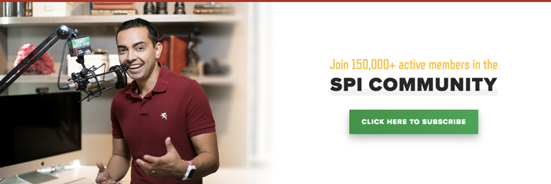
At Wishpond, we know the power of click popups and their ability to increase conversions.
Well the Smart Passive Income blog does a great job of showcasing a great-looking banner, while reducing friction by making the CTA as simple as possible.
The CTA on this page works for two reasons, first it reduces the ask of each user by simply asking them to click in order to convert, and secondly, it specifies exactly what a user should do in order to continue, “Click Here to Subscribe”.
Product Call to Action Examples
Follow these product call-to-action examples to get more people clicking on your product offers.
Call-to-Action Examples #10: Shopify
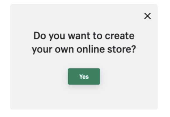
This call to action could not get any more simple, and it’s genius!
There’s only one single button the user can click on, which is “Yes” – the answer to a very straightforward question. The CTA reveals exactly what you can do with Shopify, and it makes the process seem easy with how simple the popup is. A very to-the-point and effective CTA.
Call-to-Action Example #11: Square

This example comes from Squares homepage where they succinctly describe the core value proposition in just a few words: Start selling in Canada today.
Using this simple messaging, Square is able to quickly communicate how their app can benefit users, and their CTA below gives immediate steps in order to get started.
While “Signup with Square” might seem like a very simple CTA, it does follow CTA best practices in terms of stating exactly what the CTA button will do, while also keeping it directly tied to the other content on the page.
Call-to-Action Example #12: Stripe

Now landing page best practices generally recommend sticking to one dedicated specific call-to-action per page.
That being said, anyone seasoned in conversion rate optimization knows that best practices are one thing, and testing is everything.
Well this example from Stripe might be an example of the latter.
The above example shows not one, but two CTA’s on Stripes homepage allowing users to either explore their app, or create an account and get setup.
In the case of a homepage where you have a lot of different inbound traffic, some of which are more acquainted with your product than another, it may make sense to use two CTA’s offering users to “learn more” while also giving more seasoned users the opportunity to “get started”.
That being said it’s all about testing and data, so make sure to not blindly apply anything you see online. Remember to test it for yourself to determine what’s best.
Call-to-Action Example #13: Ancestry
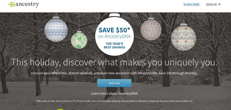
Joanna Wiebe once suggested to test headline and CTA copy together.
Well this landing page from Ancestry is a great example of that.
By changing the CTA to “Save Now” in order to correspond with the special promotion Ancestry was running at the time, they were able to reinforce the discount that the page was offering, and in turn potentially increase the total number of conversions.
Remember that next time you have a promotion or sale running!
Call-to-Action Example #14: Spotify
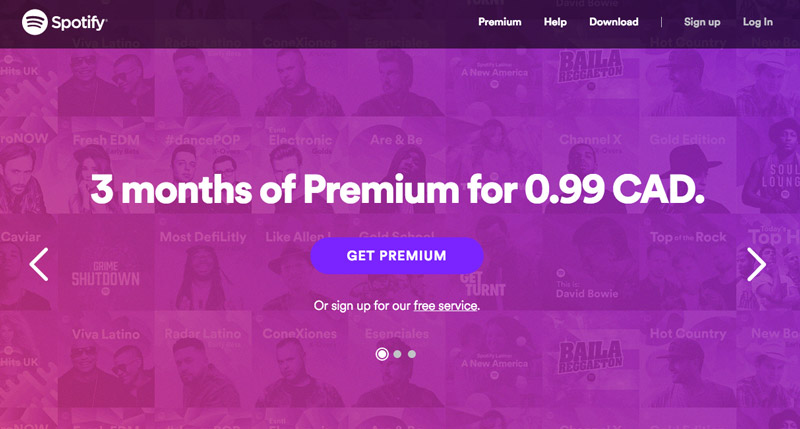
One of the best ways to keep your users engaged on your pages is to provide a clear action oriented call-to-action that tells them exactly how to get started.
Well this example from Spoty is a great example of that. On this page we see a very simple headline that breaks down the core offering: “3 months of Premium for .99 CAD”.
Then rather than making the page more complicated than it needs to be, the CTA below simply says “Get Premium”,
Especially since the price is so low, this is a quick an easy way for users to quickly take advantage of the offering their seeing on this page.
Call-to-Action Example #15: Feedly
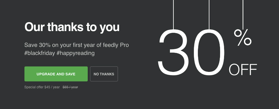
One of the most unique things about his CTA from Feedly is that they combine the action of upgrading with the benefit of saving.
By combining the two, they’re able to double the incentive for users to convert, while also keeping the CTA hyper-relevant the pages offer.
Call-to-Action Example #16: BMO Mastercard
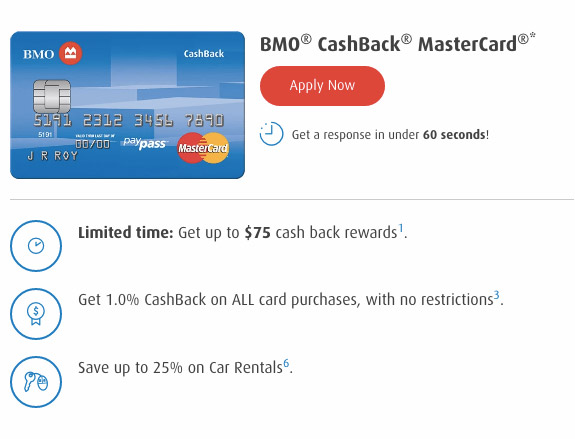
This is a great example from BMO of how to create a call-to-action that action oriented, contrasting, and focused on the specific product at hand.
Notice how underneath the CTA they also put the disclaimer “get a response in under 60 seconds” in order to combat any objections users might have about how long the application process might take.
As a tip, when optimizing your CTA’s, always remember to take into consideration the immediate area around the CTA.
Often these areas can have a high impact on the overall effectiveness of your CTA. Things you might want to add could include guarantees, company phone numbers, testimonials, or expected turnaround times.
Call-to-Action Examples #17: VRBO

This call-to-action evokes an emotion in the user. By reading “discover your escape”, you start to imagine yourself on holiday. You are enticed by the word “escape” and you realize that you can “discover” yours by simply clicking on the button…
This is one of the best call-to-action examples that makes the user feel something to motivate an action from them. This is a lot more effective than saying something straightforward like “Discover our vacation homes”.
Call-to-Action Examples #18: Netflix
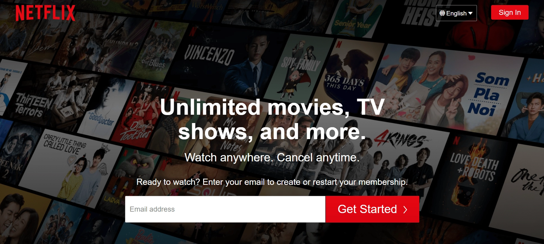
Netflix understands the power of straightforward simplicity with this call-to-action example. All of the important information you need to know is condensed into a very short, easy-to-read section. The CTA itself “Get Started” says exactly the thing the user wants to do.
All they ask for is an email address, and for you to hit the big red button. Simple, clever, and effective.
Call-to-Action Example #19: Medium

Medium is an online publishing platform that’s very popular with bloggers from all spaces.
Since they touch on such a wide range of topics, it’s understandable why they would have a rather ambiguous headline to explain the different types of bloggers and content that’s on the platform.
They use a simple “Get started” CTA which is straight to the point and action-oriented.
They were also careful to choose contrasting colors to ensure that the CTA pops off the page.
Call-to-Action Example #20: RBC

RBC displays this banner underneath some of their different product pages related to investments and investment management.
This CTA is a great example of using a contrasting CTA color, along with how to incorporate immediacy into a CTA by adding the “today” portion of the CTA text.
Call-to-Action Example #21: Google Drive
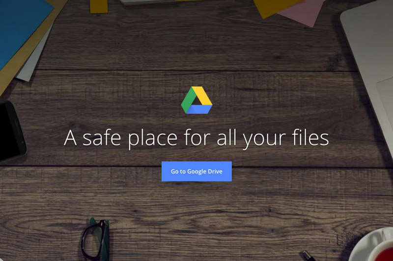
Google uses a simple landing page to welcome users to their Google Drive app.
They use a clear benefit oriented headline which states “A safe place for all your files”, combined with an easy to follow CTA that says “Go to Google Drive”.
This landing page is an excellent example of how simple a headline can be, while still providing insights into the key benefits a product can provide.
Call-to-Action Examples #22: Huemor
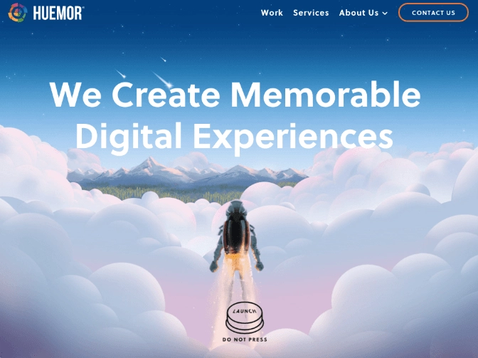
How could you possibly resist a big launch button that says “do not press”? There’s no way you’d land on that page and not want to press it.
This is one of the most creative call-to-action examples we’re showcasing. The genius behind this example comes from the graphic design of the button, and the fact that it actually says the opposite of what they want you to do.
It’s so unique and eye-catching that it would be hard for anyone to scroll past.
Call-to-Action Example #23: Mailchimp

Compared with the previous Google Drive landing page, this product page from Mailchimp is night and day.
Mailchimp uses a very ambiguous headline, combined with very artistic imagery to express elements of their brand. The CTA however is clear and to the point. By choosing “Sign up Free” they are able to combat any objections users might have about price or commitment.
Call-to-Action Example #24: Neil Patel

This is an example of a banner that Neil Patel uses on his blog in order to prompt users to learn more about his courses and consulting services.
The CTA he decided to use “Learn More” is a low ask for any user, especially since they won’t need to “sign up”, or “subscribe”.
By positioning the CTA as simply an opportunity to find out more about how Neil helped a business to grow, he’s able to reduce friction and drive more users to his subsequent landing page.
Free Trial Call to Action Examples
Do you offer a free trial? Then get inspired by these call-to-action examples.
Call-to-Action Examples #25: Hootsuite
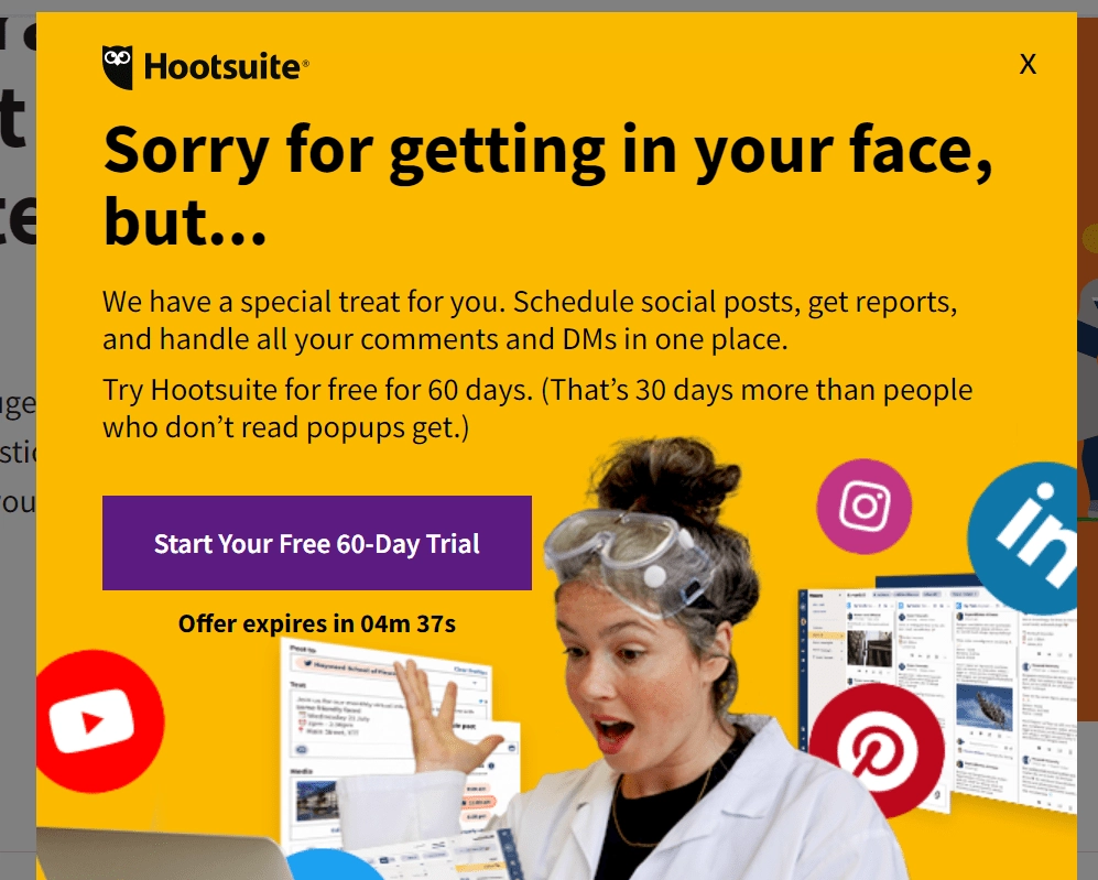
There are a few things that make this popup great – bright colors, a clever headline, and enticing text. However, we’re interested in the call-to-action.
This is one of the best call-to-action examples in the way that it presents value with the word “free” and that it’s very specific and actionable. There’s also a countdown timer below the button, which creates a very real sense of urgency.
Call-to-Action Example #26: Qualaroo
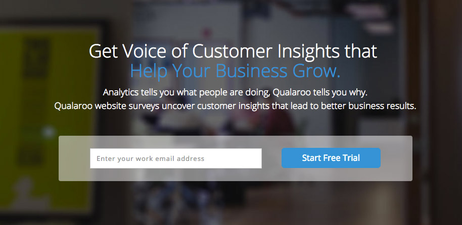
This is an example from Qualaroo’s homepage where there’s a clear call-to-action to get users to sign up for their free trial.
Notice how in the formfield they ask for a user’s “work email address” since they know that’s the email they’ll likely check the most and feels less valuable than their personal one. Beside that is a simple CTA that states “Start Free Trial”, which is exactly the action that a user will take when they click.
Call-to-Action Example #27: Resumator

Resumator uses a clear and contrasting call-to-action on the bottom of their free trial form that reads “Get Started Now”.
The fact that the button pops off the page so much, combined with the immediacy added by the text “now” makes this a good example of a well-optimized CTA>
Call-to-Action Example #28: Pipedrive

Pipedrive displays a simple form at the bottom of their different product pages in order to prompt users to signup for a free trial.
What’s interesting to note about this form is that the password field comes with a default password already typed, but allows for a user to edit it if they’d like.
This reduces the total amount of effort that a user needs to invest in order to convert.
Pipedrive also uses a action-oriented CTA with “Get Started Free”, and a CTA color that helps distinguish it from the rest of the page.
Call-to-Action Example #29: SEM Rush

SEM Rush uses a one-line form that asks for a user’s domain in order to get started with a free trial.
The CTA text that they choose, “Try it” is a very simple CTA that succinctly describes the next step a user will take in the conversion process, trying it out.
Call-to-Action Example #30: AWeber

This is an interesting example from AWeber where they combine the question asked in the headline, with the subsequent answer in their CTA.
Notice how the CTA button is also massive, making it the biggest focal point on the page.
Call-to-Action Example #31: Intercom
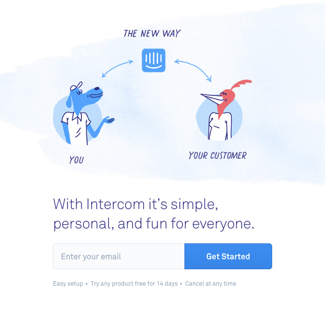
Here is an example of a product CTA to sign up for Intercom 14-day free trial.
The CTA text “Get Started” is complemented by a couple bullet points underneath that speak to any objections users might have about signing up.
For instance, they mention that it’s easy to set up and that you can cancel at any time.
Content Upgrade Call to Action Examples
Check out these call-to-action examples to help you increase conversions on product upgrades.
Call-to-Action Example #32: Razor Social
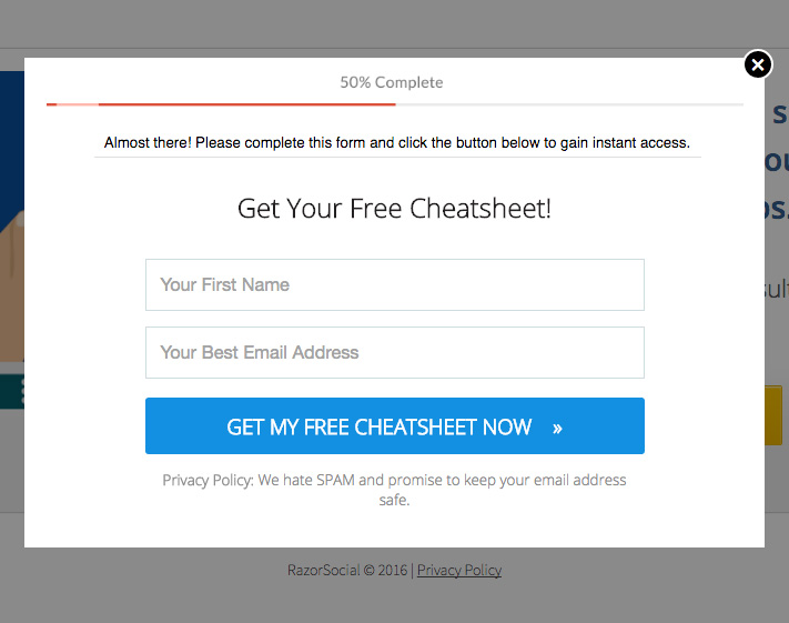
Here’s an example of a content upgrade from Razor Social. On it they offer a free cheat sheet by filling out first name and email fields.
The call-to-action on this popup is clear and action-oriented, “Get My Free Cheatsheet Now”.
Try adding the small arrow on the right of your CTA text to see how that affects your CTA’s conversion rate!
Call-to-Action Example #33: Marie Forleo

Marie Forleo offers a free audio training course as a content upgrade for visitors to her blog.
Going against typical CTA best practices, Marie made her CTA black and subtle, and choose “Yes Please!” as the CTA text.
This content upgrade is a great example of how you should test everything to determine what resonates with your audience, while also using CTA text and copy that’s inline with your brand voice.
Call-to-Action Example #34: When I Work
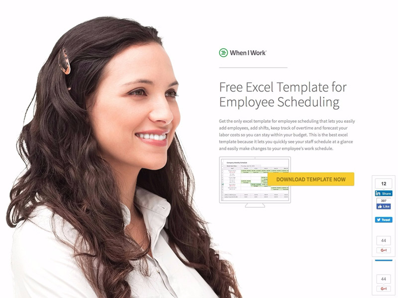
This is an example of a full page landing page offering a free excel template as a content upgrade.
Notice how the hero shot of the female looks straight at the landing page headline, at which time a users attention is automatically drawn towards the yellow CTA that says “Download Template Now”.
The great thing about this CTA is how it’s specific to the content of the page (the template), and provides clear instructions on the exact next step that a user will take once they click on the button.
Call-to-Action Example #35: Wordstream
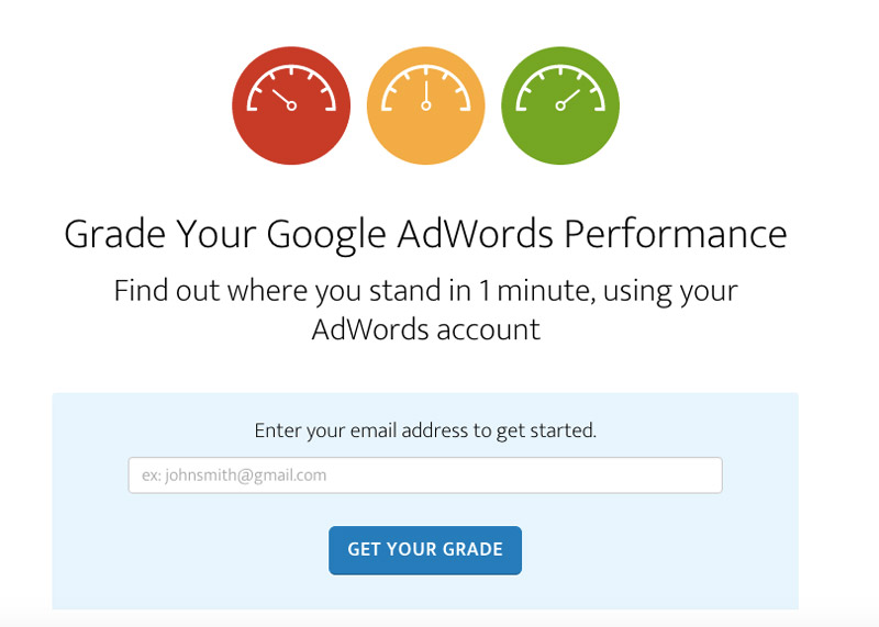
This is an example of a free tool that Wordstream offers allowing users to get a free performance report of their AdWords account.
What’s great about this CTA is how it’s clear and to the point, while also tied specifically to the action a use is taking; getting their grade.
Call-to-Action Example #36: Salesforce
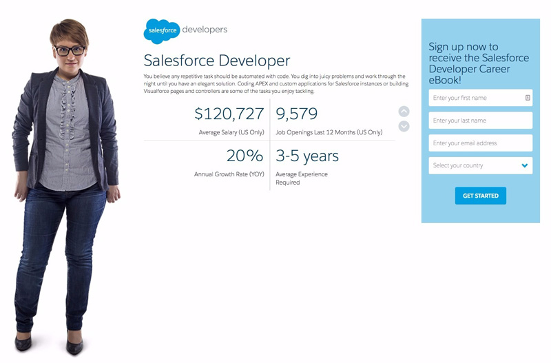
Salesforce did a great job of creating an ebook landing page targeting a specific persona.
By providing an example of what type of content would be in the ebook, they are able to intrigue readers to convert on their form.
The CTA text “Get Started” has proven to be one of the highest converting CTA’s (especially spread across different industries).
If ever in doubt, give “Get Started” a try on your own landing pages today.
Call-to-Action Example #37: Happiness Blog

The Happiness Blog has a simple popup that appears prompting users to sign up for their email newsletter.
For this approach, it’s highly recommended that you refer to interesting email automation examples and templates to send out emails easily and without mistakes.
They make good use of social credibility by adding “join 80,000+ people” within the subheadline of the popup, along with a number of bullet points that helps summarize the main benefits of subscribing to the blog.
The CTA itself however is a rather simple one with the CTA text being simply “Subscribe”.
Call-to-Action Example #38: Lemonstand
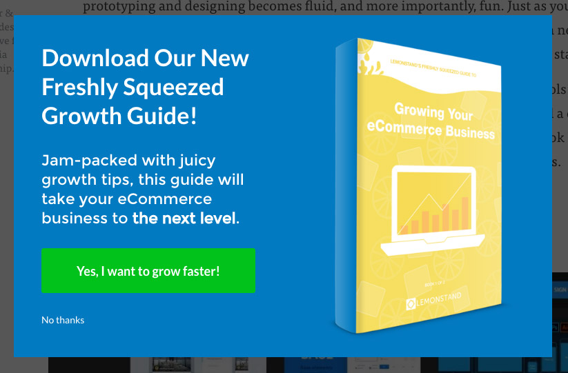
Lemonstand triggers a popup offering a growth guide to visitors of their blog.
Rather than choosing a CTA like “Get the Guide” or “Get Started”, they chose to use CTA text that succinctly explains the key pain point that a user would be trying to address by downloading the guide.
In this case, growing faster.
Call-to-Action Examples #39: Wishpond
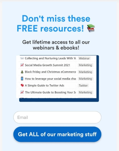
Here’s one of our favorite call-to-action examples that we’ve created. This CTA is designed to increase newsletter signups by providing them with all of our marketing content – blog posts, webinars, ebooks, and more.
The CTA text “Get ALL of our marketing stuff” is simple, straightforward, and easy to understand. It highlights the value for the user, and by writing ALL in caps, it really emphasizes that this offer is special. It’s also actionable (“Get”). This is a great way to make the user feel like they are a winner.
Webinar Call to Action Examples
Some of the most popular call-to-action examples come from webinars. If you want o get more people joining your webinar, here are some great CTA’s to draw inspiration from.
Call-to-Action Example #40: Masterclass Webinar

This webinar page uses good contrast between the CTA and the rest of the page.
Notice how in this example, they also underlined the CTA to indicate that it’s a link worth clicking.
Based on our research “Reserve My Seat” is one of the most popular CTA text for webinars, which would indicate that it likely performs well and might be worth testing on your own webinar page!
Call-to-Action Example #41: Wishpond

This is an example of a webinar CTA for one of Wishpond’s webinars.
In this example, the CTA color is highly contrasting from the rest of the page, and the CTA text of “Save My Free Spot” helps to reiterate that the webinar is free and that there’s a need to save a spot in case they might miss out.
Call-to-Action Example #42: Wistia

Wistia does a great job of incorporating best practices into this webinar landing page. Notice how they used the same color for the headline, CTA, and play button on the video?
This is to help emphasize the important points of the page and keep a user’s attention focused.
The CTA text “Register for the webinar” is simple, but works well to explain exactly what clicking the CTA will do.
Call-to-Action Example #43: Wishpond
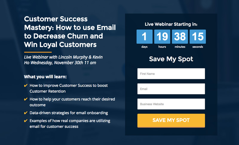
At Wishpond we run a lot of Webinars, that’s why we’ve included another example of a webinar landing page for your reference.
Notice how the CTA button in this webinar landing page is large, contrasting, and matches the text above the form?
This is important in reiterating the purpose of the CTA, and give a reason behind why someone would want to convert.
The “my” in “save my spot” also speaks to a users in first person rather than using “save your spot”.
Based on our testing, we’ve found that this small change has positively impacted overall conversion rates.
Charity Call to Action Examples
Call-to-Action Example #44: World Vision

World Vision does a good job of making their CTA’s simple and straight to the point.
After giving some context about how donors can help by donating, their CTA “Give Now” does a great job of reinforcing the action that a user is about to take.
Call-to-Action Example #45: Charity water
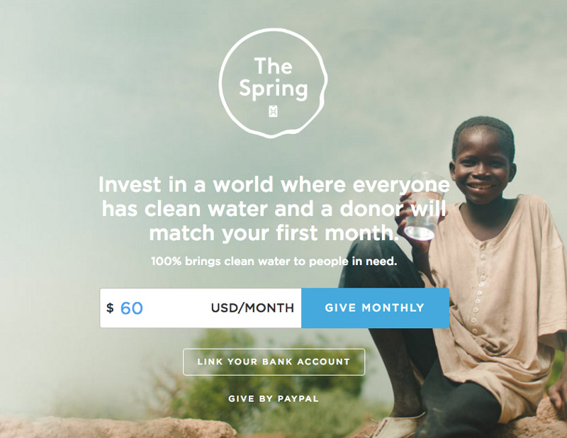
Charity Water is a charity that helps provide clean water to those who don’t have access to it around the globe.
Since they spend a large portion of their time explaining how they program works, the CTA “Give Monthly” is a clear and straightforward call-to-action about what converting will entail.
Call-to-Action Example #46: Unicef
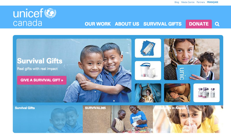
This above example is the homepage for Unicef, a charity that accepts donations to help children around the world.
What’s interesting about this example, is how they have two main CTA’s on the page, both with the same color, but with different CTA text.
The CTA on the top right is straightforward with the word “donate”, and the lower CTA is much more specific with “give a survival gift”.
This is a good example of how you can keep your CTA’s consistent on a page through things like color, but also prompt users with specific actions by changing the CTA text.
Demo Call to Action Examples
Looking to get more demos for your business? Try these call-to-action examples.
Call-to-Action Examples #47: Wishpond
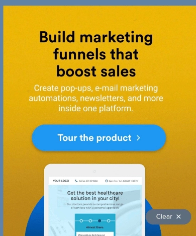
Us again with another one of our favorite call-to-action examples on our site. This CTA says “tour the product” instead of “book a demo”. It sounds more casual and it’s easier to imagine what a product tour would look like.
This helps the user feel more at ease clicking on it. It also helps them realize exactly what they will be able to find out during the product tour. It’s straightforward and to the point.
Call-to-Action Examples #48: Popupsmart
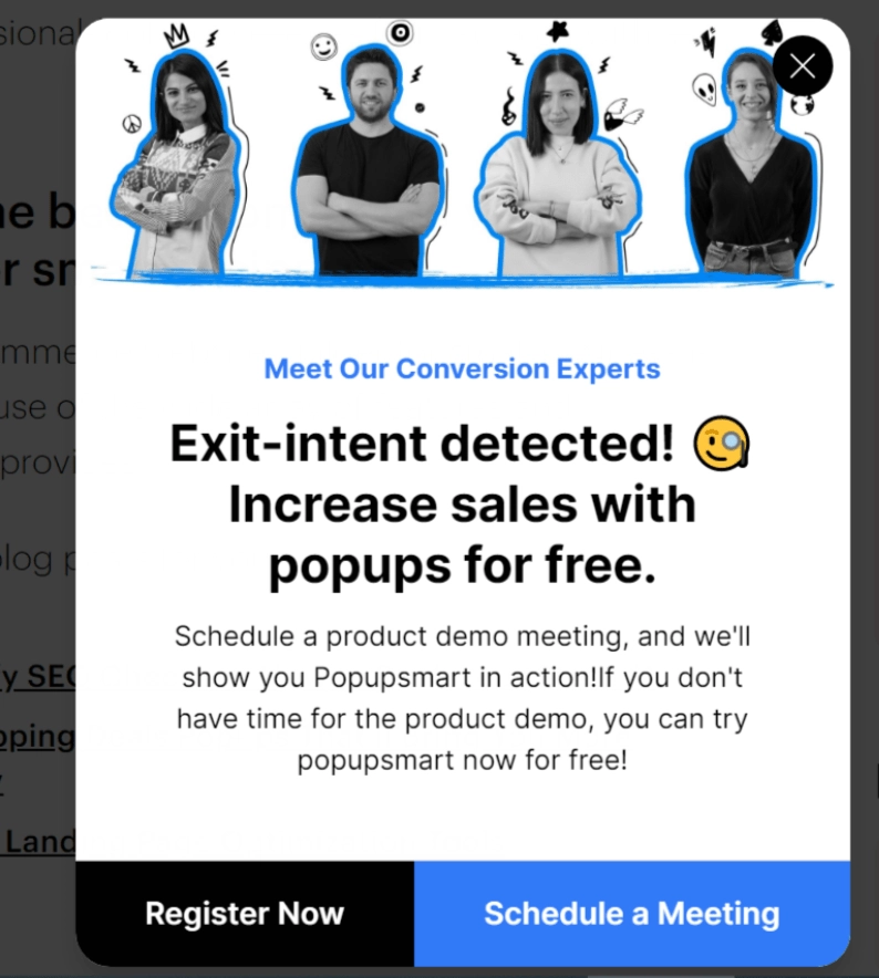
This is an excellent popup with one of the best call-to-action examples. Why? Because they give you two options that both help the company.
You can either choose to “register now” or you can choose to “schedule a meeting”. Either way, the business is able to get you one step closer to becoming a customer. The CTA examples work well because they both present very different options and ideas, but they both essentially achieve the same thing.
This is an example of a Yes/Yes popup, as there is not a “No” option in the CTA.
Call-to-Action Example #49: Schedule a Demo
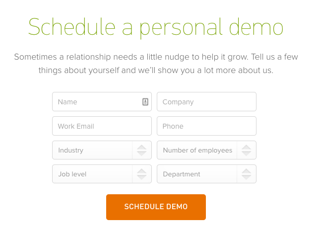
One of the primary things you want to ensure when coming up with your CTA’s is that your headline messaging and CTA text are aligned.
This is a great example of that as we see the same language “schedule demo” are used both in the headline, and in the CTA text as well.
This makes it clear exactly what a user is doing when they sign up, and can help reduce friction on a page.
Call-to-Action Example #50: Salesforce
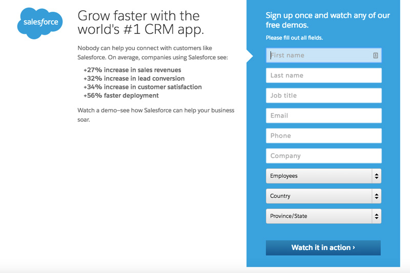
We’ve talked a lot about creating CTA’s that are action-oriented. Well, Salesforce takes it to the next level by making their CTA text “watch it in action”.
Not only does this prompt a user to take action, it automatically implies that once a user converts on the form, something will happen.
This is a great example of a way to make converting on a demo exciting, and something worth doing.
Summary
Hopefully, you found hope you found these 50 call-to-action examples useful!
As for any conversion rate optimization tips, it’s important to A/B test them on your own site and see what works best for your audience.
What works in one industry might not work for another, and what works for one business might be completely different than another.
But hopefully, this list has given you a better understanding of what options there are out there, and some more ideas of new CTA strategies that you can implement today.
Share
![]()
![]()
![]()