

Is your traffic slipping by without converting into leads?
As a marketer, knowing the dos and don’ts of B2B lead generation is crucial.
From simple design errors to missing key features of a lead generation offer, it’s possible you’re making critical lead gen mistakes without even noticing.
Here are 25 B2B lead generation mistakes you absolutely need to avoid.
Lead Generation Page Design Mistakes
A lead generation page is a webpage dedicated to capturing information from visitors, converting them into valuable leads for your business. A few examples would be a landing page, a webinar registration page or an ebook download page. As the first step in the sales process, it’s crucial that you optimize your lead generation page to maximize conversions.
1. Not Using a Dedicated Landing Page
If you’re looking to generate leads, a landing page is the critical tool you need to find success. A landing page is any page that exists solely to get visitors to complete a specific objective.
You should have a landing page for every promotional campaign you run as well as one linked to every one of your Google or Facebook Ads. Every day we see lead gen promotions linking to full websites, thereby killing conversions. A landing page simplifies and optimizes the conversion process with a single goal. For more on landing pages check out our Complete Guide to Landing Pages.
2. No Call-to-Action (CTA)
A call-to-action (CTA) button is arguably the most important feature in your entire lead gen campaign. Without one your visitors cannot turn into leads. Without leads you’re going to have a tough time getting customers and sales. Whether they’re downloading an ebook, signing up for a free trial or joining your email list, prospects need to be able to click-through and convert.
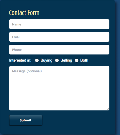
3. A Hard to Find Call-to-Action
Almost as bad as not having a CTA button at all is having a CTA button that visitors can’t find. A perfect example of this mistake can be seen below. You should NEVER make your CTA button the same color as the form or background that it sits on. It needs to stand out. This CTA button would have been much more effective at capturing leads if the company had used a vibrant contrasting color like orange or green. Ensure your CTA grabs the attention of your visitors the moment they arrive on your page.
4. Unactionable CTA Button Text
While having a call-to-action is great, its copy also needs to be optimized to increase conversions. Your button copy needs to tell visitors exactly what they’re doing by clicking through. Are they downloading an ebook? Are they signing up for a webinar? Spell it out for them loud and clear with copy such as “Download my ebook” or “Save my seat!”
Make your copy short but actionable. This means using verbs like “get”, “download” or “try” which prompt visitors to click. NEVER use copy like “Submit” or “Click here.” Proven conversion killers, they give visitors no information about what they’re signing up for or getting in return for clicking that button.
5. A Tedious Lead Capture Form
86% of visitors will leave a page if the signup request is too long. When it comes to lead gen, a time-consuming or complicated form can be conversion suicide. Use asterisks to show visitors which fields you require, and try and eliminate every field you don’t desperately need from the start of your relationship. If you have someone’s zip code, you don’t need their city or state. Keep it to a minimum with 3-5 fields for new leads and ask for more later in your relationship.
6. Too Many Calls-to-Action
If you have too many outgoing links or calls-to-action on your lead gen page you will distract visitors from converting. The last thing you want to do is confuse visitors and cause them to stray from the page before giving you their valuable information. Remember that your lead gen landing page should have just one main focus or goal. That means removing navigation or header bars from your page and keeping it simple to maximize conversions.
7. Placing Your Form Below the Fold
To capture leads, visitors need to see your form and CTA as soon as they arrive on the page. This means having your lead capture form on the top half of the page, not to be missed. As Jakob Nielsen says “Web users spend 80% of their time looking at information above the page fold. Although users do scroll, they allocate only 20% of their attention below the fold.”
Don’t forget that you want visitors to know your offer and the goal of your page as soon as they arrive. A perfect example of an above fold form can be seen below. Visitors can spot the form and CTA right away when they “land” on this page.

8. Not Encapsulating Your Form
Encapsulating your form in a box or container makes it stand out as a separate feature, obvious to every visitor. Consider picking a different shade of the background color for the form (as seen in the example above) or a different color altogether as seen below.

9. Asking for Too Much Personal Information Right Away
Would you ask someone to meet your family on the first date? That’s what I thought. A key lead generation mistake is asking visitors for too much personal info too soon. You need to ease them into giving away all of their information. If possible, try to just ask for a first name and email address. Further down the sales funnel you can gain more information from them. For example a phone number, address and postal code are fields which visitors will feel more protective of giving away. Start out with a small ask whenever possible.
10. Not Using a User-Focused Tone
When aiming to get conversions from your page you need to focus all of your attention on the needs of the visitor. Show them how your offer will benefit them and help them, rather than yourself. One way to do this is to change all of the “us’s”, “we’s”, “our’s” and “my’s” to words like “you” and “your.” This keeps an audience-focused tone, making your page more personalized to each of your visitors.
11. Showing Features Rather than Benefits
When explaining your offer to visitors, always display the benefits to them and the needs it will solve. A crucial mistake many make is showing the features of their offer rather than displaying the value it will bring to leads.
If your offer is an ebook download don’t just tell potential leads the number of pages or number of topics covered. Instead say “10 comprehensive chapters on Facebook Ads, increasing your ROI and saving you time.” Always think from the perspective of those arriving on your page, looking to solve a problem they’re suffering from.
12. Too Much Text
Landing on a lead gen page to a wall of text is an immediate turn off as a visitor. It’s hard to read, hard to quickly scan, and gives visitors a bad impression of your business. If a lead is going to fill out their information and convert, they need to clearly understand the message and goal of your page quickly and obviously.
Big bulky paragraphs are a crucial mistake. Break the information on your page down into small, easy to swallow lines and use bulleted lists wherever possible. Lists give your page white space, making it more visually appealing.
13. Not Making Your Offer Obvious
On your landing page you need to make sure it is clear what you’re offering. Have an obvious headline outlining what you’re giving away and why visitors should download or convert. If applicable, include an image of your offer, as images on lead gen pages are proven to lead to higher conversions. While your offer may seem obvious to you, it may not to new visitors. Too often see landing pages with forms and CTAs, and are left wondering what it is we would get by filling in our personal information and converting. Spell your offer out loud and clear and convey the value.
14. Bad Message Match Between Ad and Lead Generation Page
Using Facebook Ads to direct traffic to your lead generation page is a great tactic, as long as the two have cohesive and consistent messages. A mistake many marketers make is having a Facebook Ad and lead gen page that do not look alike or convey the same ideas to the visitor. When a user clicks on the ad, they should arrive on a page that they know is for the same offer. If the ad and page aren’t consistent the chances of the visitor converting drops dramatically.
An example of good message match can be seen below from Clearly Contacts. It’s easy to see they’re for the same company and for the same promotion. If someone was interested in a free pair of glasses and clicked through, they would be completely satisfied with the page they’re taken to.
Facebook Ad:

Landing Page:

Lead Gen Offer Mistakes
15. Having an Irrelevant Offer for Your Target Audience
If you want to generate leads, you need to offer something your traffic will actually want. If they’re interested in building their Facebook following, offer them an ebook or guide on “How to Get Facebook Likes and Engage Followers” or something similar.
Send out an email to your clients and existing leads asking them to complete a short questionnaire about what content they would be interested in or what needs they currently have. If your existing customers want to learn more about something, your prospective customers will too.
Too often we see companies offering content that doesn’t fit with the needs of their target audience, something which can come across as annoying to your audience looking to fulfill a need.
16. Not Having a Variety of Offers
If you’re looking to constantly attract and capture new leads, you can’t rely on the same offers over and over again. Try and vary the content you give away and have a diversified collection of offers up your sleeve. If you’re always giving away ebooks or whitepapers, look into podcasts, webinars, infographics, Slideshares or case studies.
Your audience won’t all be interested in the same form of content and there are so many different forms of content that you can easily create. In fact, only 28% of B2B marketers use between five and nine content marketing tactics to drive leads, while 64% report using more than nine. An assortment of strategies is the key to successfully building your email list.
17. An Uneven Ask vs Offer Ratio
When it comes to asking for someone’s personal information you need to ask in terms of the offer you’re giving away. If it’s a free ebook download you should only be asking for an email address and possibly a first and last name. Whereas if it’s for a free trial or something of higher value, you can afford to ask for more. If a visitor arrives to your lead gen page and sees 10 empty fields for a free case study, chances are they won’t convert.
18. Having Just One Opt-In Opportunity on your Blog
Don’t stop at just one opt-in. Use the various areas of your website and blog to display your offer. You want to expose your offer in more than one way. The implementation of a click popup on the sidebar or top of your blog, for example, is a great way to convert blog readers into leads.
An example of this on the Wishpond Blog can be seen below. This click popup drives course downloads from blog readers, who may not have otherwise found this valuable offer’s own landing page.


Mistakes on Event Registration Pages
If you’re generating leads for a webinar, conference or seminar there are certain mistakes that could be killing your signup rate. Make sure you aren’t making the following crucial errors:
19. Not Conveying Credibility
When registering for an event, visitors want to know exactly who they’re going to be listening to, watching or getting valuable advice from. If you’re an expert in the topic, you need to tell them. Don’t come across as superior, but don’t be afraid to show your qualifications or achievements. The worst thing you can do on your signup page is state irrelevant facts rather than informing and convincing potential leads why they should attend.
20. Not Showing Your Face
By displaying a photo of yourself and listing your qualifications you can convince visitors that your event is worth their time. Without an image visitors are left guessing who they’re going to be meeting or listening to. An image makes your page more appealing and you come across as more welcoming and personable.
21. Not Conveying Urgency
When generating event leads, it’s important that you convey a sense of urgency to visitors. You want them to know that there are a limited number of seats and a time limit to signing up. Try using a countdown timer, urgently phrased call-to-action copy, and displaying the number of seats left. The last thing you want is for visitors to leave your page without converting, telling themselves they’ll come back and register at a later time. We all know that most of the time they won’t. A perfect example of conveying urgency on a webinar lead gen page can be seen below:

Additional Mistakes to Avoid
22. Not Optimizing Your Lead Gen Pages for Mobile
It’s crucial that your pages are mobile responsive. One terrible mistake made by many over the past few years is having mobile visitors land on your page and find a squished and contorted form and a page that’s hard to navigate. If your visitor has to pinch and zoom to read your lead gen page, your conversion rate is going to suffer. Your form and CTA need to be just as easy to convert on mobile as they are on desktop.
23. Not Using Exit Popups
Popups are controversial, we know. But exit popups are the perfect lead generation tool that you need to be utilizing. Exit popups capture leads at the last second, interrupting visitors as they’re about to bounce from your page. They utilize mouse-tracking technology to tell when your cursor is about to exit the page, hit the back button, or open a new window.
If you’re not using exit popups today, you’re missing out on multiple opportunities to build your lead list. In fact, Larry Kim of Wordstream recently stated that adding exit popups to his site reduced bounce rates by 60% and increased time-on-site by more than 50%. Consider adding them to your website or blog, as they may become one of the main tactics of your lead generation strategy.
24. Not Segmenting Leads
Once you capture a lead, you need to be segmenting them into lists based on the offer that they accepted or converted on. A huge mistake many marketers make is treating all leads the same. This can lead to you nurturing them with the wrong type of content or a high unsubscribe rate.
Ensure that your email tool is automatically segmenting leads as soon as they convert. This breaks your list into smaller, homogeneous groups allowing you to accommodate the common needs of these groups and track their behaviors. You can segment leads based on their industry and, soon much more. Don’t treat all leads equally, segmentation will guide you to a stronger nurturing and sales strategy.
25. Not A/B testing
This mistake gets its own section as it applies to all of the above. Testing the design of your lead gen page, your offers and your event signup pages is vital to generating leads and customers for your business.
A/B testing allows you to optimize your lead generation strategies by testing what is working and what isn’t. By not testing, you may be missing out on opportunities and conversions. Even the smallest mistake in the design of your landing page or strategy could be costing you. Test, test and test again to ensure you get every lead possible.
Conclusion
When it comes to generating new B2B leads, it’s vital that you optimize your landing page, have valuable and relevant offers and are utilizing every possible tool to maximize your conversions.
Make sure to avoid these 25 mistakes, and you’ll be on the path to lead generation success.
Further Reading:
- Landing Pages: Optimizing your Landing Page for Lead Generation
- 5 B2B Lead Generation Strategies We Use Ourselves
- 25 B2B Lead Generation Strategies
-
Written by Claire Grayston
Claire is a digital content marketer at Wishpond. When not racking her brain for new content, you’ll find her hiking or snowboarding the local mountains or cozied up in bed watching a sappy rom-com.