
Social media gives you access to 3.6 billion online users. Sure, a large portion of those 3.6 billion people are primarily on social media to watch cat videos, but a percentage of people will fit your customer persona. It’s these people you are targeting.
But getting the attention of a person is not enough. Ideally, you want to convert your audience into leads. This is where social media landing pages are crucial.
In this article, we’ll look at how you can create effective social media landing pages. Before we dive into the article, let’s come up with an agreed definition of a social media landing page.
What Is A Social Media Landing Page?
A landing page is where visitors land and can make a dedicated product purchase. Social media landing pages are the destination pages for visitors who click on that link you’ve shared on social media. Both paid and organic campaigns can have social media landing pages.
So, visitors on your social platforms can click on the link from your ads, posts or bio, and land on a specific page that can showcase your products, or try to get them to take action, like join your email list. You can find a similar kind of landing page in email marketing as well.
But why do you need a social media landing page in the first place?
Why You Need A Social Media Landing Page
With social media landing pages, you can start sending your audience to the campaign-specific landing page rather than a generic website landing page. When you design campaign-specific landing pages, you can see a spike in the conversion.
If you drive people to a page that aligns with your campaign, there will be a higher chance of a conversion. Social media landing pages also make it easier to track visitor and conversion data for your analytics purposes.
According to a statistic, the median conversion rates of landing pages are between 3 to 5.5%.
Impactbnd said the landing page conversion rates of the top 10% sites are as high as 11.45%.
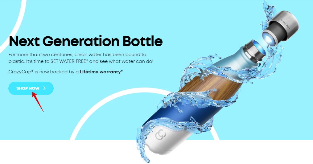
You can use such landing pages in any kind of campaign, like email marketing, FB ads, Instagram ads, or Instagram product tags. Take a look at this FB Ad from CrazyCapbottle:
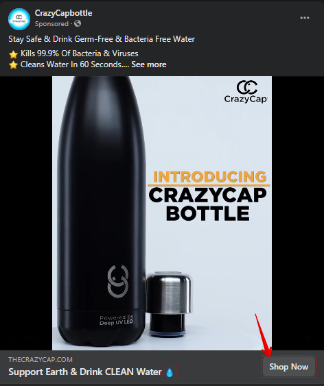
The Facebook Ad describes what the bottle is capable of – Auto Clean, Kills 99% Bacteria, etc. Once you click on “Shop Now,” it takes you to the landing page. This page allows you to make the purchase quickly:
How To Create An Effective Social Media Landing Page For eCommerce
Now that you know where you can use these landing pages, in this section, I’ll give you tips on how to create an effective social media landing page for your next marketing campaign. The tips I’ll share in this guide can be used to design any type of landing page.
1. Keep It Simple
A great landing page is effective because it directs your visitors to take a specific action. If, however, your landing page has too many elements, it can’t serve its primary purpose anymore.
This is because your page will only end up pulling your visitor in multiple directions, and they will only end up confused.
As a general rule, here are the basic elements your landing page should have:
- Product name: Mention the name of the company. Branding should be consistent with your company (so color scheme, fonts, etc.)
- Description: Explain your products with enough information. Enough to make a purchase, not too much that takes a lot of space.
- Product photos: Provide 5-6 quality photographs.
- Reviews: Show total ratings from customers.
- Call to action: This is your final instruction to your visitor. It should be clear.
Check out this social media landing page from Bellroy. When you click on the link in the bio on Bellroy Instagram, it leads you to a unique page where all the products are listed:
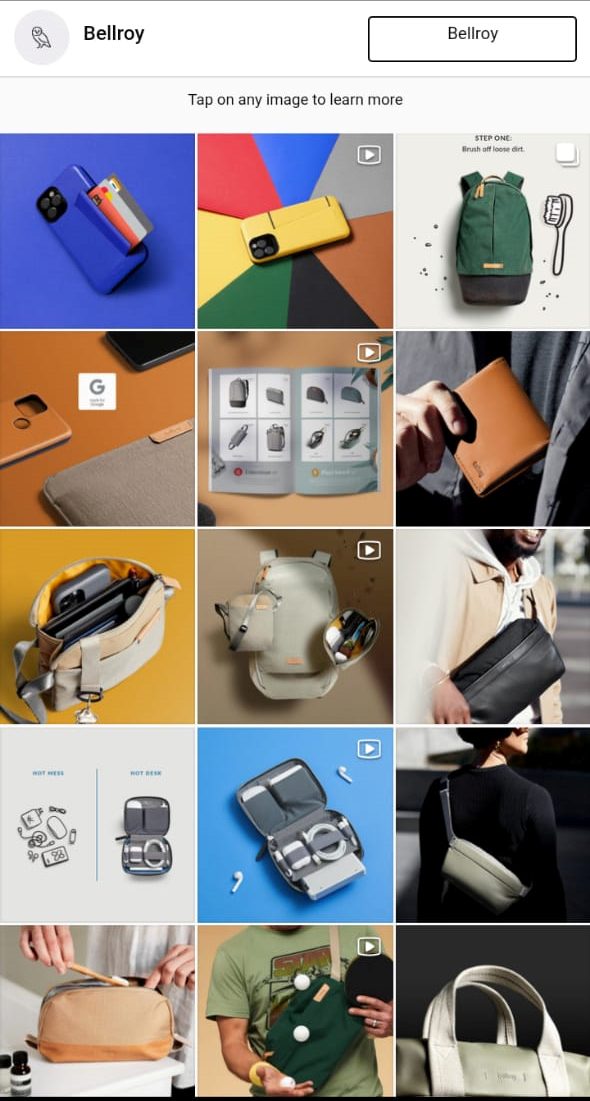
The landing page shows all the products, videos, blogs that Bellroy has promoted in their social media posts. The motive of this page is to drive visitors to the right space. The motive here can be anything – watching a brand video or reading an article or simply looking at the product.
From this page, you can reach product landing pages and make the purchase right away. For instance, take a look at this landing page of Bellroy Note Sleeve:
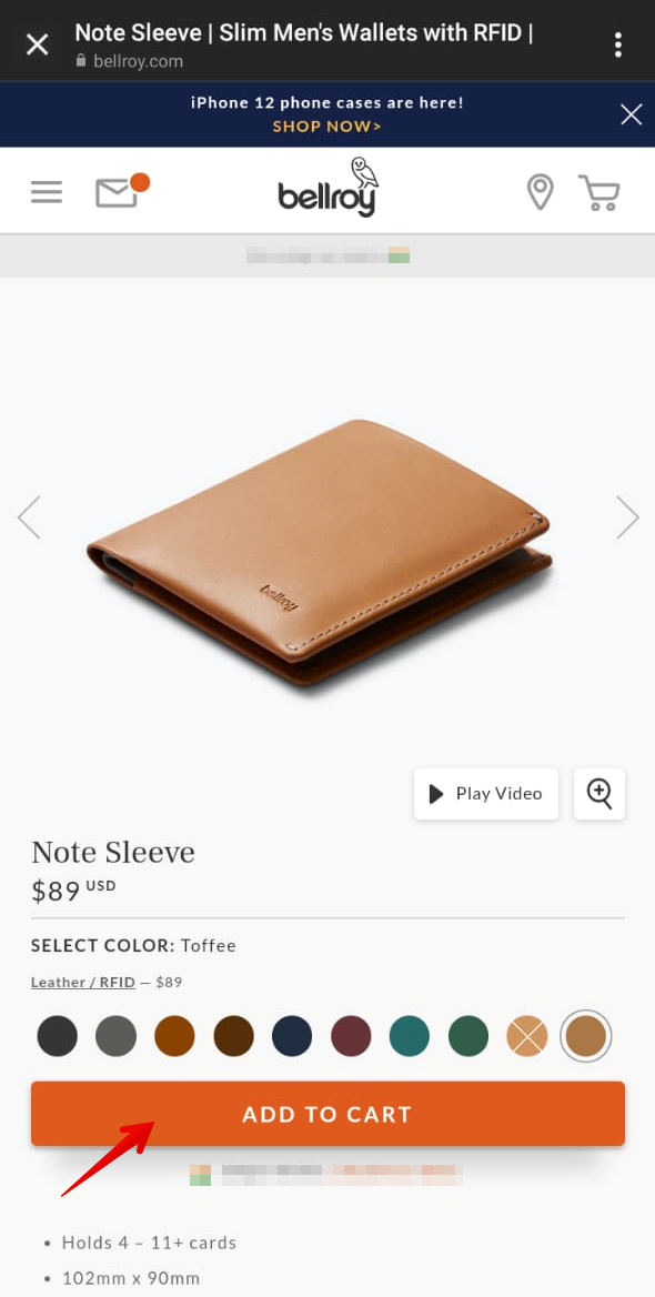
It has everything you need to make an informed purchase – high-quality images, a video, color options, product description, and a quick Add-To-Cart button.
That is a perfect example of a social media landing page. The motive of this page is to drive sales, which is what it does.
The point is, landing pages can have different motives. The idea is to keep it simple, so visitors can achieve the goal as quickly as possible.
2. Make It Mobile-Friendly
According to this article from Backlinko, almost 91% of mobile users are active on social networks. That means that, by default, your landing pages should be mobile-friendly, too.
Your visitors should be able to scroll down easily. All the elements on your landing page should also be seen even from a cell phone’s small screen. For an example of a great social media landing page, check out this one from Promo, a tool to create videos for social media:
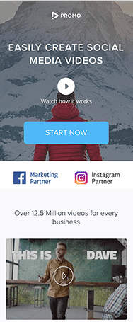
Notice how the landing page is light on text and heavily on visual and (of course) video content. In addition, the most important information is above the fold and the call to action is prominent and central. In addition, listing social media giants Facebook and Instagram as partners lends the company credibility.
Your goals might be to sell products or generate leads. Whatever it is, you would want to make sure your landing pages are mobile-friendly. Users should access every information, click every element, and scroll through the page quickly.
Need help with your next social media marketing campaign?
Book a free call to learn how our team of marketing experts can help you create high converting social media campaigns today.
3. Use Consistent Messaging
Consistency is one of the basic principles of design. Think of your social media landing page as the extension of your social media post.
That means your message across the campaign should be consistent. Your visitors should not feel like they clicked on the wrong link when they get to your landing page.
To ensure consistency, you can use the same visuals and color tones across platforms. You can use the same copy, too. Add more words on the landing page if you need to but make sure that your primary message remains the same across platforms.
Take a look at this social media post from JBL:
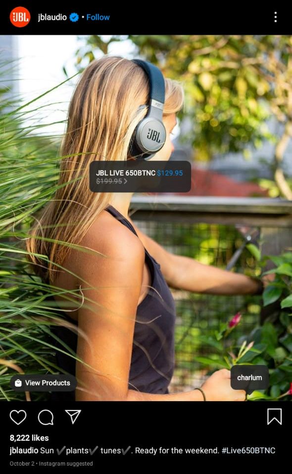
The image has a product tag with a price, and the description shows the product name. When you jump to the product page using the tag, you can see the same picture with the same model.
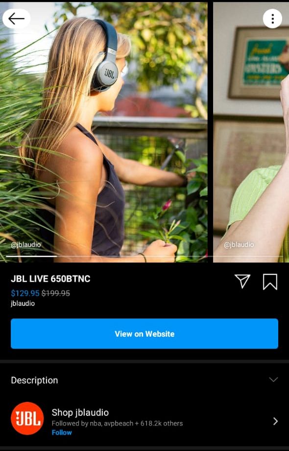
This landing page also has other quality product images, but JBL kept the first image the same as the one in the Instagram post, so people can instantly relate to the product. You can directly jump to the JBL website from here and buy these headphones.
If email marketing is one of your channels, consider designing a template that resonates with your website theme. So when subscribers open your emails, they can relate instantly with your brand.
4. Create A Compelling CTA
I mentioned earlier that your landing page should contain final instructions for your visitor. But don’t just write any words at the top of your head. Your CTA should be clear, specific, and compelling.
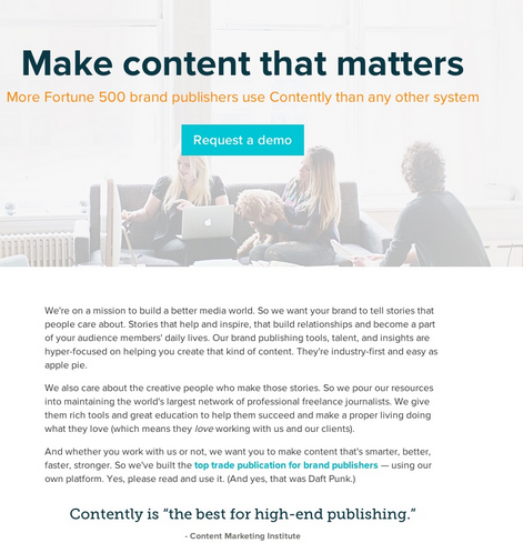
I like this example from Contently, the content marketing platform. The CTA is clear, specific, (“Request a demo”), and prominently placed under the compelling headline and a powerful piece of social proof in the sub-header.
The barrier to entry is also relatively low: Contently is not asking the visitor to part with any money just yet. All they need to do is request the demo and see the platform’s power for themselves.
If it’s vague and not specific, your visitor will only end up confused and leave without taking any action. If it’s weak, your visitor might end up not taking any action, either.
In this case, since you want your visitor to purchase your product, your CTA can be as simple as “Buy Now” or “Shop Now.” Check other call-to-action words that maximize conversions, too. The key is to choose the one that will give you the most conversions, which brings us to our final tip.
5. A/B Test
Don’t be content with the first landing page you create. It’s always possible another will give you a higher conversion rate. The key is trial and error. Keep trying until you get the best formula for your brand. And yes, every brand has a unique formula.
Something can work for you that may not work for your competitor!
So experiment with different CTAs and headlines. Change the product images and their order. Experiment with product description styles, pricing, product reviews, etc. There is a sea of things you can try here!
Create as many combinations of elements as you can with your landing page elements and monitor the results. There are so many landing page builders out there you can try and experiment with.
And when you find the one that gives you the best results, continue trying and testing whenever possible. You never know if you’ll find another one that’s actually even better.
Bottomline
Social media landing pages are crucial to social media marketing campaigns. That’s why you need a social media landing page. These landing pages have actually made purchases from social media far easier.
Now that you can consider social media as one of the sources of customers, plan these landing pages very mindfully. You have to strategize and put yourself in the shoes of your visitor. This way, you’ll know which placement of elements works and which don’t.
An ideal landing page is simple, clean, and not overloaded with content. It must get across all the required information without overwhelming the reader. Your landing page is no place for a wall of text! Keep things brief, compelling, and focused on your goal for the page.
Your landing page must have consistent messaging. One of the great things about a landing page is that it focuses on a single aim without the distraction of all your other website content.
Therefore, make sure all content is based around that goal and that your landing page has a consistent, unifying message and tone.
It’s also essential that your landing page be mobile friendly. With around half of all internet traffic now coming from mobile devices, mobile-friendly pages are no longer a nice-to-have. You should consider them a necessity and make sure your landing page looks equally good on mobile as on desktop.
Finally, the call to action (CTA) is vital. It must be clear, specific, centrally positioned, and formatted in a way that it stands out. You should also make sure it is easily actionable. If it is too difficult or time-consuming to take action, your site visitors simply won’t bother.
Once you think you’ve got all the elements of a great landing page in place, it’s time to conduct A/B tests on different elements. This will let you know which aspects of your page are working well and which to discard.
If you consider your visitors first and always bear in mind your central goal when creating your landing page, your sales will improve.
About the Author
David Campbell is a digital marketing specialist at Ramp Ventures. He helps manage the content marketing team at Right Inbox. Previously he led the content team at Voila Norbert. When he’s not working, he enjoys traveling and trying to learn Spanish.