
So you’ve designed a landing page and are driving a ton of traffic to it – but you’re getting a low conversion rate.
It could be your Call-to-Action (CTA).
When you ask yourself “What is a landing page?” it’s important to remember its purpose. It’s one of best ways to get leads for your business online (paired with ads, of course).
And remember in order to turn visitors into leads, they have to click on your landing page’s CTA button.
Your CTA is the action you want your website visitor to take. It doesn’t matter if your landing page objective is increasing sales, generating email leads or developing customer relationships, we all want more conversions!
Here’s 7 of the top CTA formulas that’ll increase your conversions.
1. Visuals, Baby!
Your CTA should be the first thing your viewer sees when they click on your page. You do build your landing pages to drive conversions, after all. The more visually distinct and clear you make your ask on your page, the more successful you’ll be at attaining your marketing objectives.
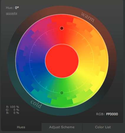
Use contrasting colors for your CTA button. As humans, we’re naturally attracted to sharp variations in colors. It draws the eye so your potential prospect immediately sees what they need to do on your landing page. Colour contrasts also subconsciously create a sense of discomfort, which make us want to take action to alleviate.
A hot trend in colour contrast right now is the orange CTA button on a blue background. It stands out and provokes a reaction.
Some marketers adamantly adhere to the notion that you should use your brand colours for your CTA. I’d agree to an extent – use your brand colour on your landing page, but contrast your CTA within your brand’s colour scheme.
There are tons of colour scheme tools available online. Use them to find the best CTA hues for your business.
Colour wheel from Color Scheme Designer:
Use whitespace to draw your viewer’s eye to your ask too. Design a clean landing pageintended to create a flow towards your CTA. Don’t cram the purpose of your page in amongst images, list of benefits and value propositions.
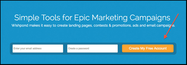
Wishpond’s landing page tool provides you with optimized templates to make your CTA stand out visually:
2. Words to Act On
The best CTA’s invoke many quick reactions. How do you do this? Use short, commonly understood, action-oriented words.
Like it or not, the vast majority of your online viewers are skimmers and scanners. The simpler the words you use to you present your ask, the more it’s going to resonate with your audience.
The more action-oriented your CTA verbs are, the more immediate reactions you’ll provoke.
Here’s a few example of conversion stimulating CTA’s, based on your landing page objectives:
Sales:

Lead generation:

Business relationship building:

I’d also recommend that you use your CTA verb in the headline. You reinforce the action you’re asking your visitor to take by making your landing page purpose very clear.
Read more landing page copy conversion tips in my recent article 21 Reasons your Landing Page Copy Doesn’t Convert.
3. Obvious Appeal
Like the rest of your landing your page, your CTA should support the key question your visitor has: “What’s in it for me?”.

Reinforce your benefits by showing your customer how their lives will be improved by converting on your page. Whether it’s a sale or your product, a piece of content or a regular email from you, make it clear in your CTA that your prospect will be better off by taking the time to fill in your landing page form fields.
Show that your business is trustworthy and thinking of your customer by using personal pronouns like “you” and “me”.
Keep the friction to a minimum to increase your conversions. Use only one CTA on your landing page. If you have multiple marketing objectives, use multiple and unique landing pages for each conversion ask. Businesses with 30 or more landing pages generate seven times the conversions.
4. Size Matters
If an element on your landing page is larger than everything else, it’s generally going to be noticed more. Your CTA is what you want noticed, so it stands to reason that your button should be big!
I’d do so with caution. You want to make your CTA button big enough to stand out, but not so big it distracts from the benefit content on your page. You also don’t want to be totally in your face with your asks. You could look like desperate and provoke your customer to take the action of leaving your page!
Neil Patel is the king of large CTA’s (and CTA pop-ups). Quick Sprout might be able to get away with these rather cheeky conversion methods, but I wouldn’t recommend you employ the tactics without developing a strong sense of trust first. What do you think?
I’d highly recommend you take a look at Paul Olyslager’s four-part series on CTA’s, including CTA button shapes and sizes for more sizing tactics.
As we’ve seen above, there are many other techniques to make your CTA stand out. A/B testyour CTA button size to find the optimal dimensions for your business, campaign and target market.
5. Location, Location, Location
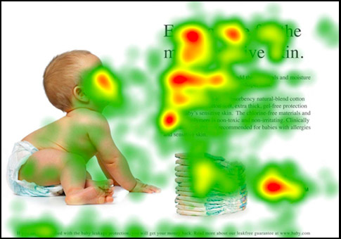
Generally speaking, people ‘read’ websites in an “F” shape from the upper left the lower right of a page. Based on this research, best practises would dictate that you put your CTA on the lower right hand side and to keep it above the fold.
Example of “F” shape heat map from Sprout Social.
If you’re just starting out with landing pages, I’d highly recommend you stick with this practise. Test your results and learn the optimal location for your particular campaign.
However, recent heat map eye tracking studies have shown this location doesn’t always result in the highest conversions. To put it in simple and obvious terms, the best practise is to place your CTA where your CTA gets the highest conversions.
Test your pages to locate the optimal spot that organically flows with your landing page design.
Keeping your CTA above the fold is also debatable. Some landing page experts have found that placing their CTA after a number of scrolls through a page actually increased conversions significantly. It really depends on your industry, the price of your offer, the extensive nature of your ask and many other factors.
Additionally, people are looking at your page through mobile, tablets and a variety of devices where above the fold doesn’t impact your conversion as much as it does on desktop.
That said, if you don’t have the time and money to A/B test your landing pages to their full optimization, or you’re finding your optimization costs are actually eating up any profits they provide, stick with the standard and place your CTA in the lower right hand side above the fold on your particular computer.
6. Directing Your Visitor
Your entire landing page should be designed to induce the conversion. Directional cues are an essential design feature in guiding your prospect’s attention to your CTA.
Directional cues can be both subtle (such as the eye direction of a face on your page) or more explicit (such as an arrow pointing to your ask).
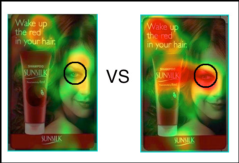
In this sophisticated directional cue example, the eye direction of the Sunsilk model was tested. In “A”, the model looks into the camera. In “B”, the model looks a the product. As humans, we tend to look where other people are looking. Sunsilk used image “B”, so clearly the subtle directional cue increase conversions.
There’s a number of methods to direct eye traffic flow on your landing page. Two top converting cues are:
Arrows:
The most straightforward method to directing your visitors attention is with arrows. You see these all the time on landing pages these days. Use arrows with contrasting colours to create a sense of urgency to look at your CTA.
Pathways:
Similar to arrows, a linear pathway naturally directs the human eye. It triggers an instinct in our brains telling us we need to follow. You can design pathways through images of converging lines, people pointing in the direction of your CTA, or even a stock image of a mountainous trail.
IconDock uses a more subtle form of the arrow and a pathway of colourful icons to direct eye traffic and gain CTA conversions.

Have your landing page design to focus on your conversion goal. The more likely your viewer is to glance at your CTA, the higher conversion rate you’ll obtain.
7. It’s Not a One Night Stand: Seduce Your Visitor
There’s nothing that lowers your conversion faster than a premature CTA.
Think of your landing page like a dating process. A first time visitor (like that cute someone you take on a first date) doesn’t know you. If you overtly go for a “buy now” CTA without building a relationship, you’re gonna get rejected. Take it slow, show your benefits and make it clear and obvious what’s in it for your customer.
Think about it, If you walked into a store you’ve never been to before, and someone immediately told you to “buy now” and asked for your credit card details – you’re likely going to walk right back out again. The same is true with an overselling or premature CTA.
Know your customers and where they are in your sales funnel.
Use wisely the CTAs to achieve the best landing page optimization and give your new visitor a chance to get to know you. For example, give options to:
- Try out your product for 30 days
- Get free content
- Subscribe to your blog or newsletter
Once you’ve seduced your new prospect, then send them to your purchasing pages to “buy now”. Measure your increased results.
Conclusion
Your CTA should be the focal point of your page. Check out good landing page examples and try out one or all of these seven methods to optimize your landing page conversions.
Read more about optimizing landing pages in your online marketing campaigns:
- Landing Pages: The Science Behind Designing for Conversion
- 21 Reasons Your Landing Page Copy Doesn’t Convert
- Landing Pages: Using the Language that Converts
- 6 Advanced Tricks to Optimize Landing Page Conversions
- Landing Pages: The Fundamentals and Conversion Principles
- How to A/B Test your Landing Page to Maximize Conversions
- 25 Creative Facebook Contest Ideas You Can Use Today
What are your experiences? How do you increase conversions with your Call-to-Actions?
P.S. Wishpond’s Facebook Contest Apps make it easy to create sweepstakes, photo contests, Instagram hashtag contests & more.