
Your website needs high-converting landing pages. To achieve this, you’ll need to get your landing page design right.
Landing pages are essential for running all kinds of campaigns and achieving all kinds of actions. You just have to make sure that your landing page is optimized to get people to click on it and take the action you want.
To help you out, I’ve created a post that provides data-driven techniques for creating high-converting landing pages.
I’ve scoured the web for the strategies that have performed best in numerous tests and case studies.
In this article, I’ll show you 15 data-driven techniques to optimize the conversion rates of your landing pages (and how you can implement them).
Let’s get into it!
15 Best landing page design tips and tricks:
- Use title case capitalization in your headline
- Make your copy scannable
- Incorporate real photos not stock photos
- Use an explainer video on your landing page
- Mention your offer in your call-to-action (CTA)
- Optimize the placement of your call-to-action
- Limit your number of form fields
- Test a 2-step opt-in form
- Use auto-focused form fields to direct visitors attention
- Use social proof to increase trust
- Sell the benefits, not the features
- Optimize your landing page design for mobile
- Don’t include a navigation bar
- Create urgency with a countdown timer for special offers
- Make your landing pages more interactive
First, take a look at this infographic on the landing page design best practices to get an idea of what I’m talking about:

![]()
Now let’s get into the logistics. I’m going to explain how to put each data-backed strategy into action. I’ll also provide a number of landing page examples to help illustrate each point. (If you do want some more theory, check out our guide to conversion optimization psychology).
Landing Page Design Tip #1: Use Title Case Capitalization in Your Headline
Small changes in your landing page’s headline can go a long way.
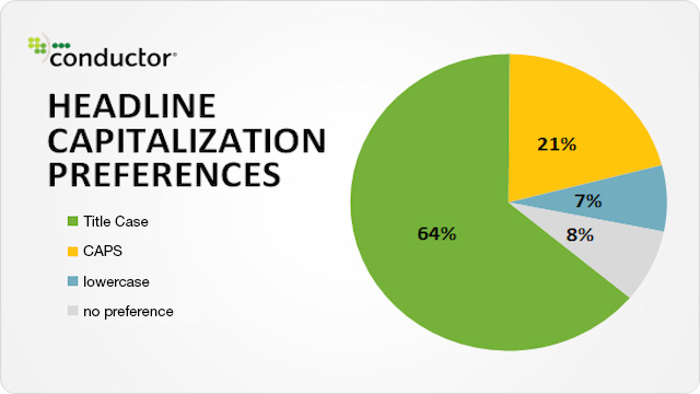
A study by Conductor revealed that almost two-thirds of people prefer the first letter of every word in the headline to be capitalized.
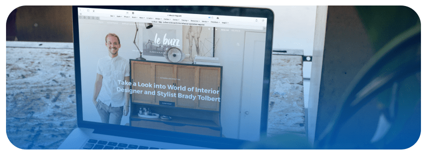
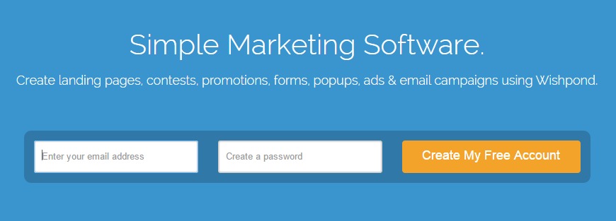
This style of capitalization is known as the title case (aka up style). Here’s an example from one of one our lead-gen landing pages using this method:
There are a few different ways to capitalize your titles, depending on which style guide you go by. When designing your landing pages, you should always be consistent and use the same style guide’s guidelines for each one.
If you don’t already have a style guide in place, take a look at Search Engine Journal’s advice:
“In titles of songs or albums and band names, blog posts or articles, the standard rule in the English language is to capitalize words that:
- Are the first or the last word in the title
- Are not conjunctions (“and”, “but”, “or”, “nor”), adpositions (“to”, “over”), articles (“an”, “a”, “the”), or the “to” in infinitives.”
Landing Page Design Tip #2: Make Your Copy Scannable
Your landing page and its content should be easy for your web visitors to comprehend – and bullet points make it easy for visitors to consume landing page copy quickly.
Dr. Jakob Nielsen (Nielsen Norman Group) ran a test where he removed unnecessary information and summarized it in the form of bullet points. He increased the usability of a web page by 124%.
This shows us that information is more easily consumed by cutting down and chopping up your copy into bite-sized bullet points.
What’s more, Unionen tested using a bullet-point list against a paragraph of text to outline their benefits and the bullet-point list resulted in a 15.9% improvement.
As WordStream says,
“The info you put front and center should be easily scannable – good landing page copy uses bullet points to explain details when possible.”
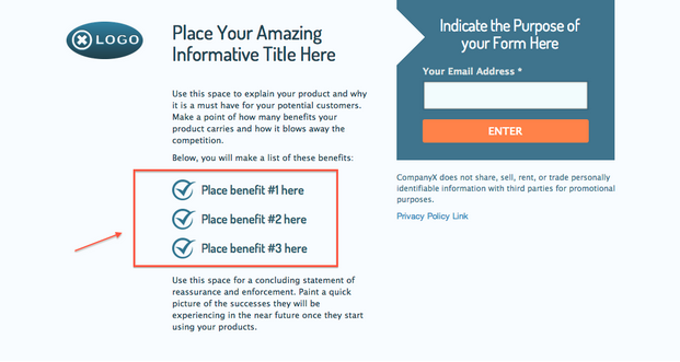
Tip: Bullet-point lists are great for outlining the benefits of your landing page’s offer – try outlining 3-5 benefits per landing page.
Benefits are different than features – they are the result of the features of your product or service.
For example:
- Feature: Lead Activity Tracker
- Benefit: See all attributes & activities related to each lead
See what I mean? If you’d like to create your own infographic feel free to use Visme!
Landing Page Design Tip #3: Don’t Use Stock Photos
There have been multiple studies and tests done on using stock photos vs. real people photos – and real people conquer.
Take a look at this test done by 160 Driving Academy. They tested a stock photo of a man driving a truck against a photo they took themselves of a student outside one of their trucks.
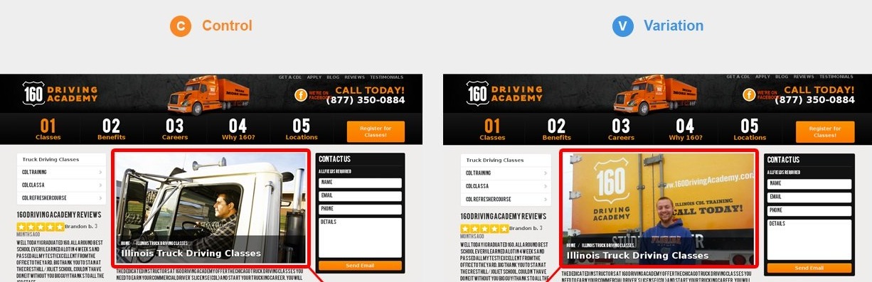
They achieved not only 161% more visits to the page but also a registration lift of 38.4%.
Anything is better than using this on your site:

You can include people in your photos, just make sure they’re your people. Something you’ve taken the time to create. Like this:

If it’s a product page, feature a photo of the product. Even if it’s just the product.
Your visitors can tell the difference between a stock photo that is used on the internet and your own photos.
Real images evoke trust. Stock photos decrease the trust your landing page visitors have, as they look staged.
Users would rather have you feature a product photo or a close-up of your face than a photo you downloaded off of Shutterstock.
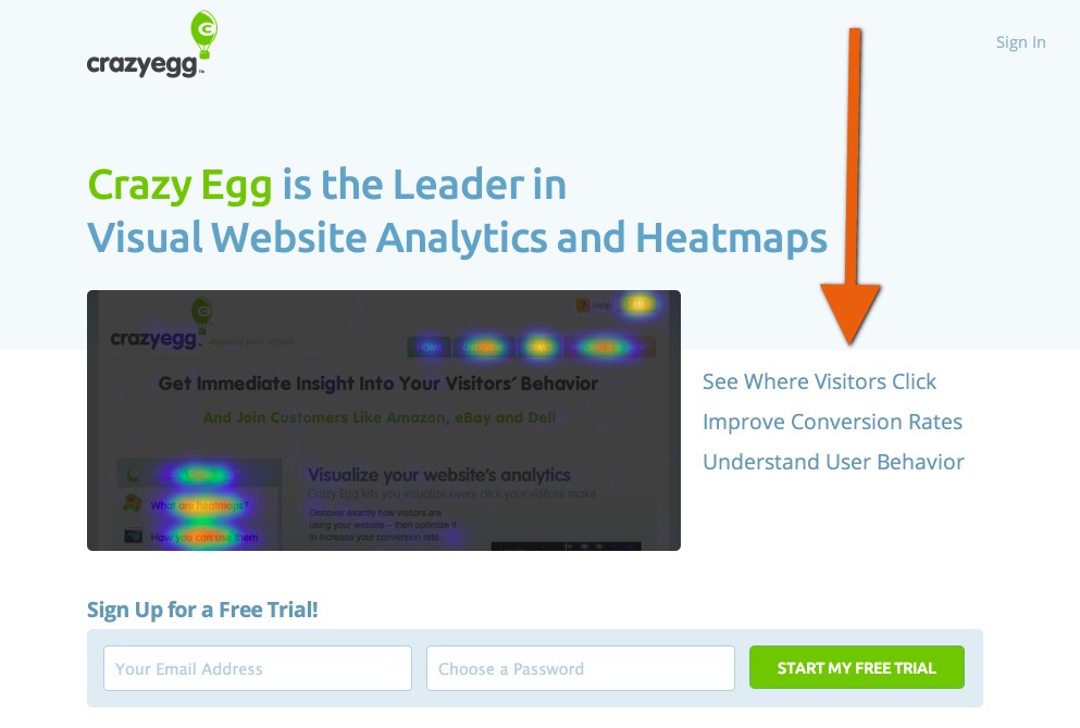
Landing Page Design Tip #4: Use an Explainer Video On Your Landing Page
Wondering what an explainer video is? They simply detail a company’s product or service in a quick yet informative video.
They tend to convert well on landing pages. In fact, some sites claim their conversion rates increased by as much as 144% with the addition of an explainer video on their webpage.
This is because explainer videos can get a lot of information across in a short period of time, explaining concepts and increasing the trust your landing page visitors have in your business.
Crazy Egg has a pretty well-known explainer video. This 2 and a half minute video works nicely because it outlines the solution to their client’s problems with an analytics tracking tool. They also talk about how they understand and can alleviate their client’s pain points.
To get started with your first landing page video, head over to How Landing Page Videos Create Massive Value and Drive Conversions
Landing Page Design Tip #5: Mention Your Offer in Your Call-to-Action (CTA).
If you’re filling out a form on a landing page, don’t you want to know exactly what you’re filling out?
Of course you do. CTA buttons that describe what your leads are agreeing to convert better.
Hubspot analyzed 93,000 CTAs over the course of a year and found that calls-to-action (CTAs) targeted to users convert 42% more than untargeted CTAs.
A targeted CTA is a call-to-action that is specific to the offer on your landing page. It’s more specific than just using one word such as “submit” which doesn’t address what you will be confirmed when you fill out the form and press the button.
For example, look at these CTA button changes made by CanaDream.
CanaDream (a vehicle rental and sales company) increased its landing page conversions by 106%. They changed the CTA button copy from “Go” to “Get RV Rental Pricing and Availability Now!”
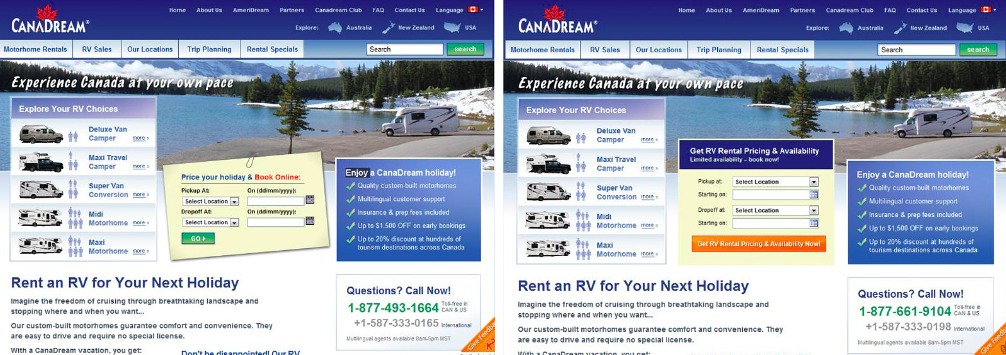
“Get RV Rental Pricing and Availability Now!” is much more descriptive than “Go” and explains what the landing page visitor will get when they fill out the form.
When crafting your CTA copy, remember to use short, commonly understood, action-oriented words.
Here are a few examples of actionable CTAs:


For more CTA best practices, check out our article: 7 Landing Page Call-to-Action Formulas for Higher Conversions
Landing Page Design Tip #6: Optimize Your CTA Placement
Where you place your call-to-action (CTA) on your page can dramatically affect your conversion rates.
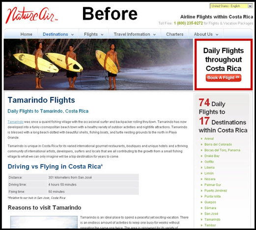
Nature Air increased landing page conversions by 591% by testing where the CTA appeared on their landing page.
Their original landing page had one CTA next to their header image:
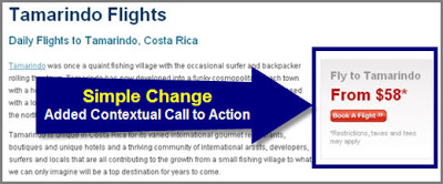
By adding a second CTA next to the body of the landing page of the offer they maximized their page’s conversions.
Put your CTA in a relevant place on your landing page. Don’t hide it in the sidebar. You want your CTA to be noticed.
What about the fold?
We’ve all heard that you should place your CTA above the fold so it’s seen – but take a second to think about the fact that your visitors want to learn a little about your offer before they convert.
As Neil Patel has said on landing page design,
“Don’t assume that placing your call to action higher on the page will boost your conversion rate. Make sure your visitors know what they are getting before you present them with a call to action.”
There’s no solid answer as to whether or not you should place your CTA above the fold. Remember to test its placement (and don’t hide it in a corner of your landing page).
Landing Page Design Tip #7: Limit Your Number Of Form Fields.
Your landing page’s form should only include fields that ask for information you require from your leads.
Why?
Many different studies come to the same conclusion – less means more. The fewer form fields you require the more leads you will collect.
Take a look at this landing page by Imaginary Landscape:

Now that’s an intimidating form! Thankfully they decided to test a variation that had 4 form fields (instead of 11).
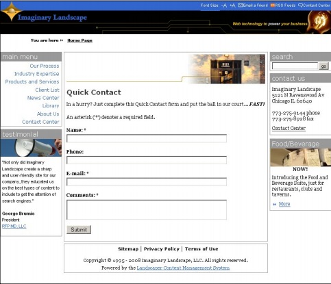
The variation with a reduced number of form fields increased conversions by 120%!
Obviously, depending on the offer, your form fields will differ. but try to keep your form fields down to 4 or less if possible. Don’t include form fields you don’t need.
Want more form field case studies? Check out how removing one form field can lift your conversion rate by 26%
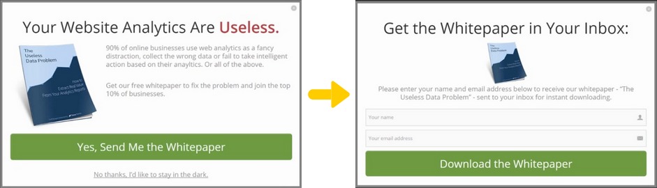
Landing Page Design Tip #8: Test a 2-Step Opt-In Form.
You know how forms work on landing pages. But what’s a 2-step opt-in form?
It sounds complicated, but it’s not. It actually de-clutters your landing page.
2-step opt-in forms appear in place of a regular form on a landing page. They often appear with just a description and a CTA button.
When people click on the CTA it then brings up an opt-in form popup. People then fill out the form and press the “submit” button and they’re done.
Check out this example by Thrive Themes:
So why would you want that extra step?
Well, as it turns out 2-step opt-in forms increase conversions.
Google it and you’ll find tons of case studies that preach the 2-step opt-in process. It’s one of the conversion optimization techniques that work for a variety of landing pages.
For example, InvestorCarrot increased its conversions by 46% the first time they implemented this tactic.
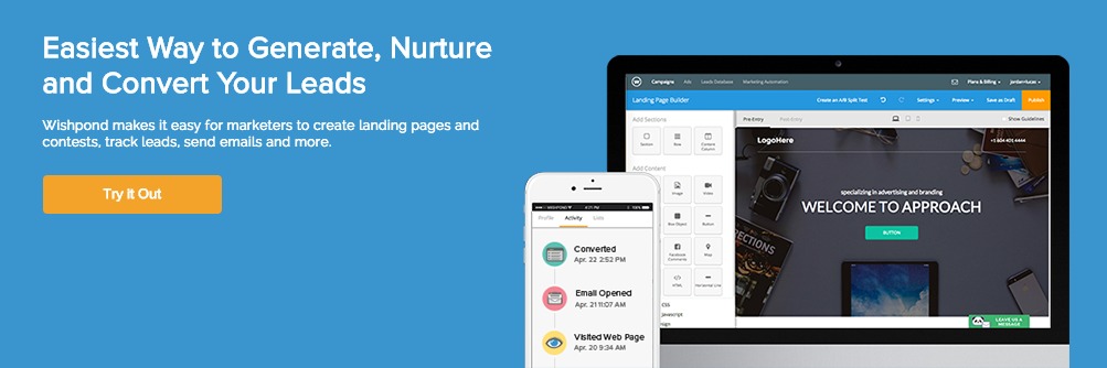
Two-step opt-in forms are easy to create.
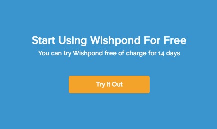
For example, if you were to make one with Wishpond you would create a landing page as per usual, and only have a CTA in your landing page form, no fields.
It would look something like this:
When your lead clicks on the “Try It Out” button, a popup will appear:
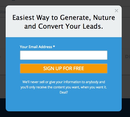
Tip: Make sure that the second step of your opt-in form looks similar in design to your landing page, or else people may close the form, thinking they have navigated away from your offer.
Landing Page Design Tip #9: Use Auto-Focused Form Fields
An auto-focused form field pre-places a visitor’s cursor (the flashing vertical line which indicates a selected field on any website) in a form field.
I’m going to give you an example of a test we ran on Wishpond.
When someone navigated to our signup page, the field for them to fill out an email address was automatically selected – they don’t have to click. All they have to do is start typing.
Can you see the line in the first form field below?
The variation beat the control by 56%. And remember this was on our signup page! This test was hugely influential on our bottom line.
This feature converts better because autofocus form fields get your visitor’s attention and make a potential lead’s step to conversion easier.
By the way, if you want to use this feature yourself, here’s the (really simple) code: $(‘input[type=”email”]’).focus();
Landing Page Design Tip #10: Use Social Proof to Increase Trust.
Social proof shows your landing page visitors that their peers (experts, friends, customers, etc.) recommend your product/service.
It can come in many forms, such as a customer review/quote, a rating of your product, logos of your current customers, and more.
Here’s an example of a customer review on our website:
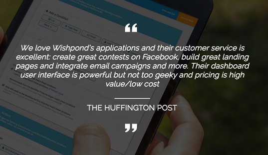
Social proof from current users of a product or service seem to be particularly effective, especially if they include some level of storytelling.
Ed Hallen (co-founder, Klaviyo) put it well:
“User social proof is particularly effective when it involves storytelling.
We tend to imagine ourselves in other people’s shoes when we read or hear a story. This is why stories are so persuasive and often more trustworthy than statistics or general trends. Individual examples stick with us because we can relate to them.”
Here’s a compelling statistic to back that up:
63% of consumers indicate they are more likely to purchase from a site if it has product ratings and reviews.
The fact is, you need a form of social proof on your landing page to help make your visitors convert.
Landing Page Design Tip #11: Sell the Benefits, Not the Features.
Why a benefits list? Why not features?
Benefits tell your users what your features can do for them.
To better understand what I’m talking about, take a look at this quote from Help Scout’s head of content:
“People have little interest in purchasing a bed. What they want is a good night’s sleep. Founders and marketers must go beyond selling products; they have to sell what their product will allow customers to do.”
Norweigan cruise line Hurtigruten increased online bookings 193% with the addition of a benefits list (it only took them 5 minutes to put together).
Your benefit list doesn’t have to be massive, either. I suggest including 3-5 benefits on your list. And this doesn’t require a daunting change in your landing page’s design.
See how Crazy Egg does it:
Landing Page Design Tip #12: Optimize Your Landing Page Design for Mobile.
Mobile usability is a major a ranking factor in search. This means if your website isn’t mobile-friendly it can hurt your SEO.
And I’m not just talking about mobile optimization, it’s more complicated than that now.
Sara Angeles of Business News Daily explained the changes well:
“Previous changes to Google’s algorithm simply required website owners to make sure their websites are mobile-optimized for better viewing on smartphones and tablets. Now, factors such as readability, responsive design and not using non-mobile friendly software (like Flash) will also be taken into consideration in a website’s search ranking.”
This is definitely a setback for businesses but will end up helping both you and your leads.
Why?
It turns out that 40% of users have turned to a competitor’s site after a bad mobile experience. That number is too high to ignore.
Mobile phone users care about landing page design.
I don’t know about you, but I can agree with the 40% as my tolerance is low for sites that I can’t easily navigate on my phone.

It’s been shown that a mobile-friendly site can double your conversions.
The easiest way to optimize your landing page for mobile is to use a landing page builder that already has mobile optimization built in, and one that allows you to edit the mobile version of your landing page.
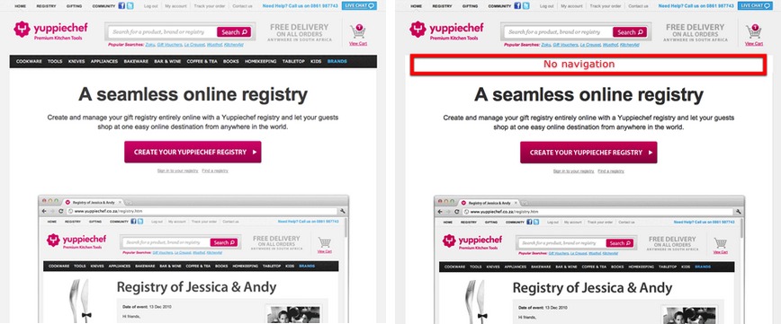
Landing Page Design Tip #13: Don’t Include a Navigation Bar.
This landing page design strategy is definitely the easiest to implement.
Navigation bars are great for navigating your website, but not your landing page.
When it comes to designing a landing page it should have a clear focus – your visitors should be clicking on a singular call-to-action. Navigation bars are the best feature to distract potential leads and throw them off their course.
In this a/b testing case study, Yuppiechef removed its navigation bar from its landing page. This increased conversions by 100%.
Carolyn Edgecomb, Community Coordinator at Impact puts it simply:
“Why would you want to distract your leads? You don’t want to give your leads any other options besides converting or hitting the back button.”
It’s pretty simple – if you currently have a navigation bar on your landing page, just try removing it. I’m sure you will see an increase in conversions.
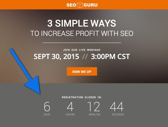
Landing Page Design Tip #14: Create Urgency With a Countdown Timer
Urgency is one of the most important aspects of landing page design.
Ever heard of FOMO? Your potential lead has a fear of missing out, so they convert. This tactic works especially well for offers that are only available for a limited time.
Here’s an example of a webinar landing page with a countdown timer:
Now let’s take a look at a test done by Marcus Taylor (CRO expert and founder of Venture Harbour):
Marcus ran an a/b test based on creating urgency on a landing page.
His control page had a CTA that said, ‘download this contract.’ the variation only had two changes, a countdown timer and the addition of the word “now” to the CTA copy. It turns out the variation had increased conversions by 147%.
Tip: Remember to keep the countdown short to enforce urgency. A countdown that’s set for 40 weeks negates the point of having a countdown at all.
Want to create even more urgency on your landing page? Check out Marcus Taylor’s article: How Creating a Sense of Urgency Helped Me Increase Sales by 332%
Landing Page Design Tip #15: Make Your Landing Pages More Interactive
Interactive content can take your landing page to a whole new level. Instead of standard static content, interactive content is more eye-catching, and more engaging, and it helps you to get your visitors to consume your most important content.
According to a webinar we ran with Brenna O’Neill, interactive landing page expert from Genially:
“Static pages and links make it very possible to lose your audience because they are going to leave your content. You might not get them back and they might miss out on the rest of the content that you have to share. We choose to focus on visual communication because the most important thing is what we see the most. This is thanks to interactivity, which is going to allow you to add a secondary layer of content. This means the user doesn’t have to seek out the content in order to view it.”
Basically, this will help your important content stand out, it will get the user more interested in what you have to say, and it makes your landing pages more exciting.
For more expert landing page tips, watch our full webinar on the top secrets for creating high-converting landing pages:
Conclusion
There you go, 15 landing page design tips to boost your conversions. These are simple strategies to apply, and they can have awesome results for your business.
I hope you’re able to test some of these landing page design strategies and find that they increase your conversions.
Have you already tested any of these ideas listed above? How well did they convert?
Let me know in the comments section below.
- 17 B2B and B2C Landing Page Examples
- Landing Page Design Best Practices Backed up with Data
- Landing Pages: Optimizing your Landing Page for Lead Generation
- Landing Pages: The Fundamentals and Conversion Principles
- 21 Ways to Generate Leads from Your Landing Page
- 25 Tips to Optimize Landing Page Conversions